
Calligraphy Appreciation
Even if you’re currently thinking “I don’t know anything about calligraphy!”, I hope you’ll continue reading. My goal is to bring more awareness to the level of detail and dedication calligraphers put into their work, describe what makes calligraphy beautiful, and teach people how to improve their own calligraphy.
Before we can truly appreciate the wonder and beauty of calligraphy, we need to understand it better.
Calligraphy as Art
Before the 16th century, decorated writing wasn’t even thought about as art — at least not in Europe. In the Middle East and Asia, decorative writing had been considered a major art form — equal to sculpture or painting — well before the 16th century.
To this day, hundreds if not thousands of incredible works of calligraphic art are hidden away in National Archives rather than on display in museums. At the time, it was simply considered writing.
Each person we can call a calligrapher or scribe brings their own personality to their work. It makes their writing distinguishable from other writers’ work even when they are writing in the same script in the same book. This is how we’re able to identify how many individuals worked on a particular Medieval manuscript and how we can identify other works by the same scribes across different books or documents.
Calligraphy
Decorative but also functional, calligraphy falls into a grey area within the realm of art – it’s an art form that isn’t entirely subjective.
Similar to the way architecture needs to fulfill certain requirements to differentiate itself from structural engineering, calligraphy needs to fulfill certain requirements to differentiate itself from handwriting.
Architecture is art when it’s not too utilitarian. Calligraphy is art when it’s not too much like handwriting. Both require a level of functionality to be what they are and yet to elevate it to art, they require something more.


Click on images to enlarge
In other words, we need to know the fundamental rules of what makes functional arts what they are before we are able to bend or break those rules with our own artistic creativity.
Handwriting
The word “calligraphy” (from the Greek words kallos meaning “beauty” and graphein meaning “to write”) began to enter European languages by the end of the 16th century and appeared in English in 1613.
Calligraphy is more than “beautiful writing”. True, it is often embellished with gold, color, miniature paintings, or flourishes, but these only decorate the underlying letters. The letters themselves are the scaffolding — the foundation — to adorn.
Even without adornment, calligraphy distinguishes itself from mere writing. It is handwritten but not handwriting.
The goals of handwriting are speed, accuracy, and legibility, whereas calligraphy requires each letter to be laid down intentionally and accurately. Readability is less important simply because there will be decorative elements that might interfere, which are part of the design. There are differences between writing artistic-looking handwriting and writing as an art.
Printing
Calligraphy doesn’t seek to imitate the printed word. It’s actually the other way around. Johann Gutenberg, the 14th-century innovator whose work led to the widespread use of the mechanical printing press in Europe, had the vision that someday, the printed word could rival handwritten manuscripts for their decorative lettering.

The written word is much older than the printed word. The mechanical process of printing on paper (using woodcuts) was invented in China during the Tang dynasty before the 8th century CE (History of Printing in East Asia), but handwriting has been discovered from as early as the 35th-32nd century BCE.
By the 1560s, the printing press had taken over publishing the written word in Europe, and literacy rose sharply. The key to the printing press’s popularity was a system of components made from wood or metal called ‘moveable type’ arranged within a frame. Once prepared, the frame could be set into a printing press to quickly and accurately reproduce multiple copies of the frame’s contents.
Even after printing was well-established as a form of disseminating information, writing by hand still had its place. There are many extant examples of books of hours (personal prayer books used by the wealthy), for example, that were produced after the rise of printing. As demand for printed materials increased, the demand for hand written materials decreased. This change in demand led to a widening distinction between everyday, utilitarian handwriting and more elaborate, decorative forms of writing (Britannica).
This was the beginning of calligraphy as an art.

Script or Hand, Never Font
The word ‘font’ comes from the Old French word fondre, meaning ‘melt’ and refers to the method used to manufacture the reusable metal components that made up moveable type. (The Etymology of Font). Font has also come to mean the style of letters used on a computer.
Different styles of Calligraphy letters are referred to as ‘scripts’ or ‘hands’, never ‘fonts’.
image by Michael Josh Villanueva from The Philippines, used under the CC BY-SA 2.0 license via Wikimedia Commons
Art
One’s experience of art is subjective as individual tastes differ. And yet, if we are to claim that some artworks are better than others, or explain why some artworks stand the test of time and are valued by generations, we need to refer to some standards by which to judge them.
DR. LAURA D’OLIMIO, THE ETHICS CENTRE
What makes something “art”? “Art is in the eye of the beholder,” that is, subjective, but the observer experiences art. Art influences us and moves us. It catches our attention and begs us to notice. It tries to provoke a reaction – positive or negative.
If all this is true, how do we “measure” art? How do we say whether or not art is “high quality” or “poor quality”?
In the case of calligraphy, a functional art, we have rules to follow.
The Rules of Calligraphy
In order to elevate it to the status of art, there should be composition — a planned and measured sense of order that takes into account the use of space on a page, harmony — a pleasing relationship between elements on the page including a relationship between the proportion of letters and spaces, rhythm — patterning and repetition that provides emphasis and draws the reader’s eye from one word to the next, and perhaps the most difficult to define aspect — individual style.
ANONYMOUS
Composition
“a planned and measured sense of order that takes into account the use of space on a page”

Composition is about the balance and proportion of positive and negative space. Overall, the composition should be visually pleasing.
In art, positive space is the subject matter — the element(s) on the art surface. Negative space is the background and the blank space that shows through the positive space elements.
For calligraphy, the positive space is the letters, and the negative space is the area around and between the letter strokes.
Being conscious of the negative space when planning and writing calligraphy is essential. Negative space draws the eye into the subject matter areas and gives it room to evaluate what it sees. Conversely, too little negative space makes the letters look cramped.
Calligraphy should be part of a balanced composition, not a constricted one. Even when letters are written right up next to each other, the spaces between the letters should be roughly equal to the spaces inside the letters for good visual balance.
Too much inconsistency in the spaces between and inside the letters is jarring to the eye and will cause a lack of focus as the eye bounces around, finding all of the places where the letters are different sizes from their neighbors.
Examples of Composition in Calligraphy


Click on images to enlarge
Elements of Good Composition
- Balance of positive and negative space: managing the space between and around the elements on the page
- Layout: a plan for how you will arrange a given space
Harmony
“a pleasing relationship between elements on the page including a relationship between the proportion of letters and spaces”
Harmony is a principle of art that describes the way visual elements interact with each other. No one item should compete with the other for attention. There are many types of things that can be harmonious or disharmonious in art, but not all of them apply to calligraphy.
In calligraphy, harmony means that the relationship between the bulk of the words, individual characters, and even the space between each letter should look like it belongs next to its neighbors.
In historical calligraphy, there are many examples of capitals that are purposefully out of scale or a different color compared to the surrounding letters. These capitals stand out and therefore draw the eye right to them.
Historical Scribes used this technique to start new paragraphs or sections of the manuscripts they wrote instead of using negative space.
Examples of the Use of Harmony in Calligraphy


Harmoniousness in Calligraphy
- Page elements do not compete with each other for attention or space
- Agreement between elements such as letters or words so that they seem to go together
- Proportions and styles of letters are cohesive even if they are not the same size or script
Ancestry
Ancestry is not a true principle of art, however, it is important to calligraphy as an art form.
All writing can trace its history back to its origin — a place and time where certain raw materials were available. These materials became tools that gave characteristic shape to the way letters were written.
Pens can take many forms depending on what materials they’re made of. Each type of pen creates its own set of effects and gives a distinctive shape to the letters. Using tools that are of the same materials as were used in history, or made from modern materials that mimic the authentic shapes is crucial to recreating the historical forms.
For example, many styles of writing that originated in Asia use a brush to create letter characters. Northern Europeans used the tips of feathers from native birds (quills) as writing instruments, and Southern European/Mediterranean people used pens cut from sturdy reeds that grew on the shores of the sea.
Calligraphy artists often emulate the letter shapes and styles of history and they will always add a little something of their own that changes the shapes just slightly. This is natural and expected.
Examples that Show Calligraphic Ancestry
The first example, Beinecke MS 315, is written in a script called “protogothic” which shows a transition between “Carolingian” and Gothic scripts. Carolingian has very rounded letter forms and protogothic is much more angular. After approximately 100 years, the second example, The Bronholm Psalter is a typical example of a Gothic hand called “Prescissa”.
Comparing the shapes of the letters ‘g’, ‘d’, ‘u’, and ‘o’, you can see the evolution of protogothic into prescissa.


Click on images to enlarge
Nods to Ancestry
- The tools used to create the letters are important to creating the shapes of the letters themselves
- Each hand has its own defining characteristics related to elements of letters such as length and shape of ascenders/descenders, letter slant, letter spacing, line spacing, terminals/serifs.
- The defining characteristics of the letters can tell Paleographers (those who study historic writing) and book historians where and when a manuscript was written

Regional Variations and the Evolution of Letters
Just like languages, scripts have predecessors, dialects, and evolution.
As people moved around the world in history, they shared their style of writing and decorating pages with each other.
Religious scribes often traveled with multiple books with the purpose of exchanging knowledge.
It wasn’t uncommon for a scribe to travel to a somewhat distant monastery and stay for the length of time it took for them to copy out a manuscript (called an exemplar) to bring back home with them.
image: Estoire del Saint Graal, France (Saint-Omer or Tournai?), c. 1315 – 1325, Royal MS 14 E III, f. 6v
Rhythm
“patterning and repetition that provides emphasis and draws the reader’s eye from one word to the next”
Rhythm is a deliberate flow in calligraphic writing that creates feelings of pattern and emphasis within the eyes of the viewer.
The amount of time it takes to create a letter stroke can’t be too long or too short. If it takes too long, the straight parts of the letter will wobble slightly. If one writes too quickly, the strokes will be less precise and crisp — moving more toward handwriting.
In another way, rhythm refers to the body movements — shoulder and arm vs. hand and wrist, and the smoothness of the pen on the writing surface. The inexperienced writer relies on hand movement rather than arm movement to create the letter strokes. Initiating movement from the shoulder while keeping the wrist and hand nearly still allows for smoother curves and straighter straight lines.
Rhythm is a part of the process that we can only recognize by the results on the page. It’s body movement that requires a lot of practice to build up muscle memory and achieve consistency.
The result of good rhythm is that the letters will be consistently well-formed — not running together or at differing heights. The eye moves along a line of rhythmic text smoothly. Rhythmic gestures produce fluid writing.
Examples of Rhythm in Calligraphy


Click on images to enlarge
Identifying Rhythmic Writing Patterns
- Smooth, well-timed kinesthetic movement originating at the shoulder and using the arm to produce smooth letter strokes
- Calligraphy practice builds muscle memory. It takes a lot of practice to train your hand to shape the letters consistently
Individual Style
“and perhaps the most difficult to define aspect — individual style”
Individual style is the creative signature each artist brings to their work. An influence that only they can bring.
Creativity is that ephemeral motivation to try something different – something unexpected. It is a slightly different way of looking at the same thing with a unique perspective. It’s problem-solving, exploration, trial and error, and discovery.
Calligraphy as art tries to provoke an emotional reaction. The artist’s goals are to invoke a more profound meaning and communicate with the reader on the linguistic and creative levels.
Calligraphy as art catches our attention and demands our focus. It tries to provoke an emotional reaction. The artist’s goals are to invoke a more profound meaning and communicate with the reader on both the linguistic and creative levels.
Like any writing or any language, calligraphy is an ever-evolving art discipline rooted in the past and transforming slowly into the future.
Examples of Individual Style in Calligraphy


Click on images to enlarge
Expressions of Individual Style in Calligraphy
- Variations are expected in calligraphy. Each artist will add their own slight variations; embrace them!
- Creativity emerges in fascinating ways. Don’t be afraid to experiment
- Mistakes can be creative. Pause before attempting to remove a mistake and think about how it might be incorporated into the flow of the piece. For example, did you shape a letter “incorrectly”? If you like the way it looks, can you go back and shape all the other letters of that type the same way?
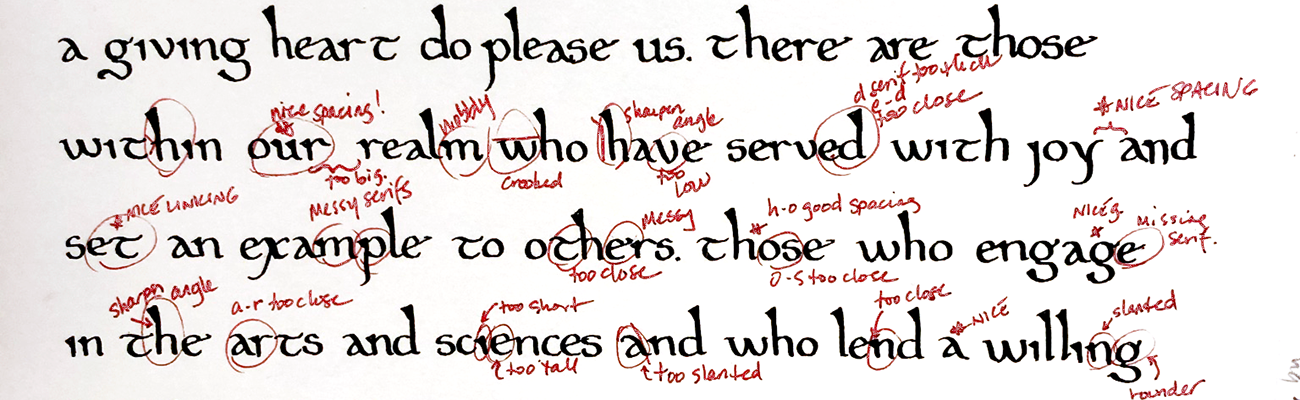
Evaluating Calligraphy
If we agree that each of the elements that make up excellent calligraphy can be improved, we need to evaluate how it can be improved.
How to Evaluate Your Own Work
Critical self-evaluation of your calligraphy work is key to improving it. Practice is essential to developing letters with characteristics that make them recognizably rooted in history and for your individual style to emerge.
Step one: Walk Away
Put the work away for at least 8 hours. Do not skip this step. Before you try to critique your work, you need to step away from the micro-focused, hypercritical view. Then, when you come back to it, you will see it as a whole again. Often I find I like my work much better when I return. Sometimes I am genuinely amazed at how much better it looks after a break.
Step two: Evaluate Composition
- Prop the work up and look at it from a few feet away so that you’re seeing shapes and not individual letters or strokes.
- Look at the positive and negative space. Are these two elements balanced or well-planned? Is it pleasing to your eye?
- Is your eye unintentionally drawn to any particular area because of gaps or constricted areas?
Step three: Evaluate Harmony
- Are there any elements on the page that seem to compete for your attention? Do they all look like they belong together?
- Are there any elements that lack cohesion with its neighbors or with the overall piece? For example, how many different letter styles did the artist use? Do they look like they go together?
Step four: Evaluate Ancestry
- Move closer to the work again.
- Understand the characteristic elements of this hand. The most common differentiators are:
- height and treatment of the ascenders
- length and treatment of the descenders (do they end in a straight line or curl back over themselves?)
- letter slant for some or all of the letters
- letter spacing – especially inside the ‘o’s and between each letter
- treatment of terminals – that is, how each stroke ends or begins
- Do the characteristic elements of the hand shine through in this example? Remember that it doesn’t have to mimic an extant example exactly. See “individual style“
Step five: Evaluate Rhythm
- Move even closer to the work
- Are the individual strokes that make up each letter smooth and fully inked where they should be? If not, make sure the end of the pen (the nib) is fully in contact with the paper throughout the motion.
- Are there noticeable thick and thin sections to each letter? If not, make sure that the angle of the end of the pen to the paper is correct for the hand and that it doesn’t change as you create the strokes. Watch out for gripping the pen too tightly. Gripping the pen too tightly for too long causes hand fatigue and makes it more likely that you will try to change your grip on the pen as you write. With a modern pen, you probably don’t even notice when you’re doing it, but with a flat-tipped or pointed-tip pen, its angle to the paper is crucial and must be intentional.
- Notice the long, straight strokes; are they genuinely straight, or do they wobble at all? If they wobble, try to write them slightly faster next time
Step six: Evaluate Individual Style
- Evaluating individual style is the most challenging because it is the most subjective
- Looking at all of the elements you’ve already examined, does the overall piece show creativity?
- Did the artist take the opportunity to arrange or embellish or play with the words/letters/punctuation in a visually clever or interesting way? Even if they didn’t, is the overall work pleasing to you?
- Does the art provoke an emotional reaction in you?
Video: Critiquing Your Own Work
Remain Objective
Above all, remember to judge your calligraphy and not yourself.
Show yourself the compassion you would extend to a friend who was at your same ability level because being hard on yourself is discouraging.
Calligraphy isn’t easy. It can take months or years to develop a stunning hand, and every time you put pen to paper is an opportunity to take one step closer to that.
Evaluating Others’ Work
Obtain Consent
Before evaluating others’ work, it’s essential to establish whether or not that person wants your feedback. Unsolicited feedback is unwelcome, potentially rude, and often discouraging – especially to a beginner. Also, be sure to ask what type of feedback they want and if they would like you to focus on any particular aspect of their work.
Obtain Background
Having a general sense of how long a person has been practicing calligraphy is helpful to establish the kinds of things they might want to work on next. Anything they can tell you about the goals or purpose of the artwork will be helpful as well as the hand they used.
Practice Means Improvement
Notice that I say “practicing calligraphy.” Calligraphy is constant practice. I have been practicing calligraphy for over 30 years. I critique my work often, and I am still improving.
Start with the Positive
Remember that this is art, and we can’t do art wrong.
Use steps 2-6 above to assess the work using your inside voice. As you go through each section, point out the things that went well. It’s a comprehensive list, and many people don’t look at half of these things when evaluating another person’s calligraphy.
Give One or Two Recommendations for Improvement
Depending on a person’s experience level, recommend one or two things to work on next. Unless they ask for it, no one needs a to-do list. The newer someone is to something the more overwhelmed they will feel by a long list that they’re unlikely to remember anyway.
What to Look for
These are examples of the kinds of things I have encountered many beginner, intermediate, and advanced calligraphy students need to work on to take their art to the next level.
Beginner
- Are they shaping the letters well? If ‘o’, ‘e,’ ‘c,’ and the parts of the ‘d’, ‘p,” g’ that go on the line are all pretty much the same level of roundness or squareness, then they’re doing well! If not, that’s a good place to start improvement.
- Are vertical lines straight if they’re meant to be?
- Are they using guidelines so that the heights of the letters and the spaces between the lines are consistent? They should be. If they’re using guidelines, are their letters going fully to the top and bottom of the lines every time? They should be; this is an example of poor rhythm.
Intermediate
If they’re doing all of the above, here are some common areas intermediate students often need more focus on:
- Are the spaces inside their letters consistent? Look again at ‘o’, ‘e,’ ‘c,’ and the parts of the ‘d’, ‘p,” g’ that go on the line. Focus your eye just on the negative space inside each shape to check for consistency.
- Are the line spaces proportionate to the height of the letters? Does the text look cramped or too spread out? Composition and the consistency of negative space as it relates to lines and words is one of the biggest things intermediate students
- Adding creativity and trying to get away from having to mimic extant hands too closely
Advanced
it’s worth noting that even advanced students can benefit from reviewing the common things to work on from the other sections. In general, advanced students are working on smaller adjustments to the rules discussed above as well as:
- Consistent letter shape and form
- Consistent and appropriate spacing letter and word spacing are possibly the most difficult things to master. More advanced students will begin to notice that some letter pairs need more or less spacing between them in order to look consistent with other letter pairs. Compare the space between the letters in the following pairs: “ki” or “re”. There and between the following pairs: “mn” and “ne”
Be Kind
Most importantly, always approach evaluations with compassion and kindness. It can feel very vulnerable to receive critique.
Everyone makes mistakes, mistakes can turn into brilliant individuality, and everyone has something to learn.
Receiving Critique
Hopefully, you have invited this review.
Simply by asking, you demonstrate your desire to improve, which is the best way to frame the rest of the session. Everyone makes mistakes. EVERYONE. One of the great things about art is that we have the potential to find new skills and abilities and create beautiful mistakes.
If you haven’t asked for this critique, feel free to tell them that you’re not ready to receive their feedback right now thankyouverymuch.
It can be challenging to listen to someone critique or judge your work. Sometimes it’s hard not to take criticism personally. Remember that it’s not personal; It’s about learning to improve.
Listen to what the person has to say. Hopefully, they come from a place of compassion and kindness with the spirit of helping you take your work to the next step.
Remember. Calligraphy is a marathon, not a race. You really only need to focus on the next step in your journey.
In the immortal words of artist Bob Ross:
sometimes you learn more from your mistakes than you do from your masterpieces
Image Credits
PRINTING
- Kish Tablet, photo taken by Locutus Borg, Public domain, via Wikimedia Commons
CALLIGRAPHY AS ART
- “Wells Cathedral Lady Chapel, Wells, Somerset, UK”, photo taken by Diliff, Public domain, via Wikimedia Commons https://en.wikipedia.org/wiki/File:Wells_Cathedral_Lady_Chapel,_Somerset,_UK_-_Diliff.jpg
- Bocskay, Georg (calligrapher), and Joris Hoefnagel (illuminator). “Butterfly, Marine Mollusk, and Pear” Mira Calligraphiae Monumenta, J. Paul Getty Museum, www.getty.edu/art/collection/objects/2300/ Ms. 20 (86.MV.527), fol. 118.
COMPOSITION
- Cod. Sal. IXe Livre d’heures — Paris, 1420/30, Universitätsbibliothek Heidelberg, https://digi.ub.uni-heidelberg.de/diglit/salIXe/0081, fol. 35r.
- Missale Gallicanum vetus, fragm. I-II (Fasz. I), Vatican, Biblioteca Apostolica Vaticana, https://bibliotheca-laureshamensis-digital.de/bav/bav_pal_lat_493/0164, Pal. lat. 493, fol. 78r.
HARMONY
- The Author Hearing the Story of Gillion de Trazegnies in Romance of Gillion de Trazegnies, 1464, Lieven van Lathem, illuminator, and David Aubert, scribe. Tempera colors, gold, and ink on parchment, 15 5/16 x 11 in. The J. Paul Getty Museum, https://blogs.getty.edu/iris/medieval-manuscripts-alive-middle-french/, Ms. 111, folio 9
- Quran, circa 1600, Southern Methodist University, https://www.smu.edu/Bridwell/SpecialCollectionsandArchives/Exhibitions/Manuscripts/ScriptureandWorship/BRMS31-Quranc1600, BRMS31
- “Arjuna Battles Raja Tamradhvaja”, circa 1616-1617, Abd al-Rahim ibn Muhammad Bairam Khan Khan-i Khanan, Patron. Ink, opaque watercolor, and gold on paper, H. 15 1/2 in. (39.3 cm) x W. 14 9/16 in. (37 cm). The Metropolitan Museum of Art, https://www.metmuseum.org/art/collection/search/140008626#fullscreen, 55.121.30
ANCESTRY
- “Beinecke MS 315: Gemma animae, etc.,” Online Exhibits@Yale, accessed June 12, 2021, http://exhibits.library.yale.edu/document/10734. Folio 23v-24r.
- “The Bromholm Psalter MS. Ashmole 1523”. Oxford, Bodleian Library MS. Early 14th century. https://digital.bodleian.ox.ac.uk/objects/7f9e58ea-2b0e-4bb5-a9c9-f8529ba3d5b6/ f.098r.
RHYTHM
- “Scripture Histories, Laud Misc. MS 622” Oxford, Bodleian Library, Late 14th Century. https://digital.bodleian.ox.ac.uk/objects/a179ab36-1fb4-4a23-91b6-37fe4e2f3719/
- “Odes, MS Burney 181”, British Library, 1st quarter of the 16th Century. http://www.bl.uk/catalogues/illuminatedmanuscripts/ILLUMIN.ASP?Size=mid&IllID=2353 f. 5
INDIVIDUAL STYLE
- Bocskay, Georg (calligrapher), and Joris Hoefnagel (illuminator). “Creeping Forget-Me-Not, Insect, and Planthopper” Mira Calligraphiae Monumenta, J. Paul Getty Museum, www.getty.edu/art/collection/objects/2341 folio 57.
- Bocskay, Georg (calligrapher), and Joris Hoefnagel (illuminator). “Insects, Basil Thyme, and Land Snails” Mira Calligraphiae Monumenta, J. Paul Getty Museum, www.getty.edu/art/collection/objects/2375 folio 89.
Citations
- D’Olimpio, Dr. Laura, “Ethics Explainer: Aesthetics”, 24 January, 2019, The Ethics Centre, https://ethics.org.au/ethics-explainer-aesthetics-what-makes-something-art/
- History of Printing in East Asia, Wikipedia, Wikimedia Foundation, 31 March 2021, en.wikipedia.org/wiki/History_of_printing_in_East_Asia
- Brown, Julian T., Williams, Robert, et al. “Calligraphy.” Encyclopedia Britannica, Encyclopedia Britanncia, Inc., 22 Feb. 2019, www.britannica.com/art/calligraphy
- “List of Oldest Documents”, Wikipedia, Wikimedia Foundation, 24 April 2021, https://en.wikipedia.org/wiki/List_of_oldest_documents
- Zafaris, Jeff, “The Etymology of Font“, Useless Etymology, 14 November 2017, https://uselessetymology.com/2017/11/14/the-etymology-of-font/
- Wells, Chelsea, “The Ultimate Guide To Positive & Negative Space In Art”, 5 January, 2020, Art Ignition, https://artignition.com/negative-space-in-art/
- Flores, Angel, “Composition in lettering”, 27 February 2014, Slideshare, https://www.slideshare.net/AngelFlores44/composition-in-lettering
- Scott, Dan, “Harmony in Art – What It Is Plus Master Painting Examples”, 4 September, 2019, Draw Painting Academy, https://drawpaintacademy.com/harmony/
- Velimirović, Andreja, “What is Calligraphy? Discover Different Types of Writings”, 12 December, 2016, Widewalls, https://www.widewalls.ch/magazine/what-is-calligraphy
- Clayton, Ewan, “A Short History of Calligraphy and Typography”, 17 July, 2019, The British Library, https://www.bl.uk/history-of-writing/articles/a-short-history-of-calligraphy-and-typography#
- Kwakkel, Dr. Eric, “Making Medieval Manuscripts”, 22 March, 2017, Brewminate, https://brewminate.com/making-medieval-manuscripts/
- Nutt, H. W., “Rhythm in Handwriting”, February 1917, The Elementary School Journal, Volume 17, No. 6, The University of Chicago Press, https://www.jstor.org/stable/994041
- De Hamel, Christopher, Medieval Craftsmen: Scribes and Illuminators, University of Toronto Press, 1992, p 34-35
- Witte, Michelle (compiler), Ross, Bob, “Happy Little Accidents: The Wit and Wisdom of Bob Ross”, Running Press, 2017
- Sassoon, Rosemary, “The Practical Guide to Calligraphy”, Thames and Hudson, Ltd., London, 1982, p 22-25.
Very interesting research! Thanks for sharing. Great work.
What a wonderful resource for both practicing artisans and those who appreciate their work! I think it’s fascinating and feel much better equipped to have conversations on scribal matters. Your thoughtful presentation and commentary demonstrate your mastery of this art form — in that not only do you understand it well, but you can clearly communicate it to others. I I think it will also be extremely useful to me in my own art form (printing) when thinking about layout in a more holistic way.
Well done! I really enjoyed reading this and appreciate all the history and ‘how to give critique’ aspects. Really great exhibit!
Excellent presentation! I had never really looked at Calligraphy as an Art Form before. I had always just assumed it was simply a type of writing used in Medieval times.
Very interesting. I sometimes feel that I struggle with consistent word spacing, especially when the text has to fit into a pre-defined space, such as on a charter master. I am encouraged by your suggestion of adding creativity and moving away from trying to exactly copy a particular hand from an example.
Thank you! I’m so happy that I was able to encourage you to explore your creativity (especially when faced with a “mistake”)!
Consistent and proportional spacing is something I was somewhat relieved to find that professionals struggle with too!
If you’re interested, I’m happy to share my techniques for doing calligraphy on charter masters to make things fit – or techniques to make sure things fit on originals!
Thorough and thoughtful. So much food for thought!
Thank you so much! Glad I made you ponder something!
The distinction between “handwriting” and “calligraphy” is good to think about. Useful discussion, especially the things to examine to evaluate you own work. The admonitions to kindness and consideration are also very appropriate, as it is easy to feel discouraged. Thanks for persevering to get this up so we can all learn.
Thank you. A very informative read. Lots to add to my toolbox.
You’re welcome, thank you for commenting! I’m curious, was there anything in particular you think you might use in the future?
Thank you for writing this! As a beginning calligrapher, this really helps me be conscious of more than just forming the letters as I see them in books. I will be keeping the notes I’ve made while reading your Exhibit and referring to them when I next calligraph.
Thank you for commenting! I’m glad you didn’t find the information too overwhelming for a beginner! That’s very good to know.
Forming the letters the way you see them in books or in ductuses (ducti?) is a great way to get started building the muscle memory. That’s usually the beginner stage. Being conscious of how you form the letters (proportion, spacing) is a way to level up and will make a big difference in the overall appearance of your work.