The Mira Calligraphiae Monumenta
The Writing Model Book known as the Mira Calligraphiae Monumenta (Getty MS. 20, also called the Getty Codex) is a small book – only 16.6 x 12.4 cm (6 3/8″ x 4 7/8 inches) consisting of 129 pages (also called folios).
It was the work of a Hungarian scribe, a secretary named György (Georg) Bocskay and finished in Vienna in 1562.
In 1596, twenty-one years after Bocskay’s death and thirty-four years after its completion, a Flemmish painter named Joris Hoefnagel illustrated the pages of the model book – drastically and permanently changing its appearance.
Model Books
Model books, also known as copybooks, were very popular in Europe in the 16th-18th centuries with some of the most popular being from Italy.
These books showed the reader how to make decorative and sometimes elaborate letter shapes. They also contained advice for learning how to write or instructions for sharpening a quill.
Several so-called “writing masters” published books like these and became quite famous. With the adoption of the printing press, they were widely distributed and went through multiple revisions and re-printings.
Bocskay’s Model Books
Bocskay’s model books used examples directly from contemporary model books of the time such as Arrighi, Palatino, Amphiareo, and Neudörffer but he liked to play with the letter forms and add his own style to them.
Although they were never published (mass-produced), Bocskay used his model books as practice for official documents and other projects he worked on throughout his career. Other students at the Chancellery may have used them as inspiration.
Letters Patent of Miklós Oláh
In 2018, Dr. Borbála Gulyás, a Hungarian art history professor studying Bosckay made an amazing discovery. She found extant legal documents written by Bocskay in the National Archives of multiple European countries including Hungary and Italy.
The following document is one of the ones recently discovered by Dr. Gulyás.
The date of completion for these letters patent (created for a Chancellor of Hungary from 1558-1560) coincides closely with the timing of the creation of the Getty Codex (1562) and a quick comparison shows striking resemblance between letter styles of the two pieces.
It shows excerpts from three pages of the Mira on the left side and where the lettering from those pages has been used in the official document. This was a very exciting discovery!

(click to enlarge)
Goal
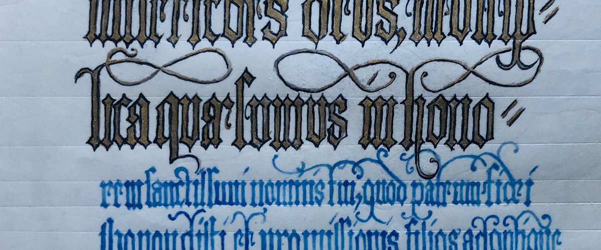
My goal for this project was to reproduce folio 44 of the Mira Calligraphiae Monumenta as it looked when the original artist considered it complete.
That is, before it was illustrated.
I set out to do this using the same tools and materials that a Renaissance artist living in Vienna in 1562 would have used or had access to.
Extant Folio
The folio as it exists today contains illustrations on most of its pages. The illustrations were not done by the original artist and were not part of his plan for the book.
Today the pages of the manuscript are referred to by their illustrated elements. The illustrations have overshadowed the beautiful writing instead of allowing the writing to stand as a work of art in its own right.


Left: Extant folio 44 with illustrations
Right: Extant folio 44 with illustrations digitally removed
My Reproduction

Materials Comparison
Note: Differences in the materials I used compared to what the artist used in the 16th century are highlighted in bold.
What the Artist Used
- Fine white vellum 0.15cm thickness
- Powdered gold ink, genuine ultramarine ink, and iron gall ink
What I Used
- Fine white vellum 0.15cm thickness
- Powdered gold ink, genuine ultramarine ink, and iron gall ink
Method Comparison
Note: Differences in what I did compared to what the artist did in the 16th century are highlighted in bold.
What the Artist Did
- Pricked and blind ruled last four lines
- Applied inks with quill pens of various sizes
- Purchased hand-made powdered gold ink*
- Bought powdered ultramarine and made blue ink*
- Had an apprentice make oak gall ink*
What I Did
- Pricked and blind ruled all lines
- Applied inks with quill pens of various sizes
- Purchased hand-made powdered gold ink
- Bought powdered ultramarine and made blue ink
- Made my own oak gall ink
Note: items above marked with * indicated the action the artist likely took based on my research.
What I Changed and Why
- The folio was trimmed down when it was bound. I created the reproduction on a slightly larger piece of vellum to restore the composition of the original piece.
- I added visible guidelines for every line because I needed to see them better.
- I did not include the illustrations in my reproduction because they were not created or intended by the original artist. The illustrations were added 31 years after the piece was written.
Biggest Challenges
Viewing the Manuscript
I requested access but didn’t get to see the Getty Codex in person.
I was able to have an ongoing dialogue via email with both Nancy Turner, the Conservator of Manuscripts at the J. Paul Getty Museum and Dr. Thea Vignau, the world’s foremost expert on the illustrator Joris Hoefnagel. Both of these women were interested in the work I was doing and provided valuable information about the Getty Codex.
The J. Paul Getty Museum makes images of the pages of the Mira Calligraphiae Monumenta available for download from their website however, Ms. Turner shared an even higher resolution scan with me in order to try to show me more details than can be seen with the naked eye. This was instrumental in my work.
Page Size
I knew the pages had been trimmed but I didn’t know their original size so I needed to extrapolate. I chose to do this based on another one of György Bocskay’s model books.

Detail of superimposed pages from the Vienna Model book by Bocskay. Red line shows top margin measurement
Creating Blue Ink
Creating blue ink was more of a challenge that I expected when I chose folio 44 for the reproduction project.

It sent me on a fascinating scientific research journey into how ink was and is made and the rarity of blue pigment throughout history. See below for way more information!
It has inspired me to explore more ways to make 16th century European pigments and inks as well as ways to make the color blue.
Latin Transcription
Transcribing the Latin text was tricky. The letters are written close together and are meant to be more decorative and less legible.
I have never studied Latin so it was hard to extrapolate unfamiliar letters from word order or context. The letterforms became much more familiar as I worked on practicing them and by the end of the project I was able to read the text without a problem.
I think this experience will help if I want to transcribe other pages in the codex since the calligrapher uses this style of writing on other folios.
The Internet provided help too. I made a big breakthrough when I found an online transcription of the text of the second prayer (the last 4 lines of the page) because it turned out I had guessed some of the letters incorrectly.
Text Size and Placement
Centering the text on the page was one of the most challenging things I had to do.
I practiced the letters on a separate sheet of vellum, and measured them with a ruler before I wrote them on the final page.
While I was writing on the final copy, I used the previous line of text as a gauge to know if I was on or off track. It wasn’t as simple as that though. If the pen or the strokes were too wide or too narrow, or if the space between the strokes or letters was too wide or too narrow, the line of text would be a different length.
Because I was trying to replicate someone else’s work, I didn’t want to break the lines where they needed to in order to make the overall composition balance.
I wanted to achieve the same spacing as the master but that proved incredibly difficult and I will need a different tool to match that work.
Ink Flow Using a Quill Pen

Writing with powdered (shell) gold and the ultramarine blue ink were incredibly challenging compared to writing with the iron gall ink. I think multiple factors went into this but mainly it was due to ink composition.
All ink is made from particles of color (pigment) in suspension. Both the gold and ultramarine inks impart their color onto the writing support by depositing tiny particles of pigment (hopefully) evenly along the path of the pen.
As a result, the gold and blue inks were granular coming off the pen and getting it to flow was a balancing act between binder and liquid. Too much binder and ink and the flow stopped but too much liquid distributed the pigment too much and the resulting color was pale and washed out.
Iron gall ink does not contain particles because its color comes from a chemical reaction and so it was easier to write with than gold or blue.
Additionally, thoroughly scraping the ink off the inside of the quill tip seemed to help the ink flow significantly, as did splitting the tip of the pen.
Writing Tiny Letters

There are 11 lines of text on folio 44 of the Mira Calligraphiae Monumenta. The text gets progressively smaller as it goes down the page. The smallest x-height line on the page is only 1mm tall.
The first line of black text I was able to get well-spaced and the letters came out pretty well centered. I used a crow feather quill with a flat end approximately 1/8 mm wide.
The second line of black text, despite being done with the same quill, came out a bit longer than the original.
With both of these lines I felt that I was able to use the pen to form the letters clearly and with the same decorative serifs the original piece showed even though they were very small.
This told me that the size of my pen was slightly too large but close to correct.
The eighth and ninth lines needed a smaller pen. I cut a different crow feather quill to a point.
Again, I felt I was able to use the pen to form the letters clearly and with hints of the decorative serifs but the letters took up much more width than on the original.
I stopped writing at the 10th line of text, with sixteen characters remaining and I was already past the point where the original stopped.
This told me that the point of the crow quill pen was not even close to the correct size. It is too large. This is disappointing because I will need to source smaller feathers and do further writing tests to determine the correct pen size needed to complete the work.
Greatest Discoveries
Artist’s Skill
I am convinced that György Bocskay was the most amazing calligrapher I have ever known of all time.
It’s hard to imagine that when he was doing his work in the early 16th century, it wasn’t considered “real art”.
I have been practicing the art of calligraphy for thirty years – the length of time of Bocskay’s career – but I can’t come close to matching his skill with the pen.
I admire his art greatly – for by any standard, his work must be considered art.
Discovery of Extant Legal Documents
The main source of information I could find at the beginning of this project was the Getty Museum’s facsimile copy of the manuscript: Mira Calligraphiae Monumenta: a Sixteenth‐Century Calligraphic Manuscript Inscribed by Georg Bocskay and Illuminated by Joris Hoefnagel published in 1992.
According to that book, not much was really known about György Bocskay’s origins, life, or career. The documents he produced weren’t considered art until well after his death. He wasn’t famous and therefore, his life story was more obscure.
Dr. Borbála Gulyás’s research from approximately 2010 to the present was invaluable to my project and shed a lot of light on the purpose of this beautiful manuscript.
Quill Pen Issue Diagnosis and Correction

The numerous issues I had with getting the ink to flow properly off the end of the quill pen taught me a lot about the perfect mix of conditions needed to write in the early 16th century.
I gained many valuable diagnostic tools such as learning when the problem was with the quill (not sharp enough, not clean enough, not pointed enough, needs a split tip, too dry, too soft) and when the problem was with the ink (too runny, too thick, particles not mixed enough).
I feel much more practiced at using these tools and I am eager to use them again.
How Ink is Made
Since I wanted to make my own ink from period materials, I needed to learn more about how it was made in the 16th century.
I learned the chemistry needed to make black iron gall ink and learned to make blue ink from ultramarine pigment using two different methods.
What Natural Materials Make Blue
For as long as I can remember I have loved the color blue.
Through this project I learned a lot about the history of the color blue and how rare and precious it is in nature. I want to explore even more natural sources of blue.
Next Steps
Smaller Feathers
I would like to find a feather that could write small enough to make the last two lines the correct height and width.
So far, I have experimented with the tiniest feathers I had: turkey and jay.
The small turkey feathers I had weren’t hollow and therefore couldn’t be cut into a pointed pen.
The jay quill has a very narrow shaft and writes very small but it is hard to hold steady in my hand. This could possibly be remedied by adding reinforcement to the feather’s shaft.

I’d like to research what other birds might have been available in 16th century Vienna that could have provided small-yet-sturdy enough feathers to write 1mm tall letters.
Update: I have acquired more feathers!
Recreate More Folios
Now that I have acquired more skill in working with self-made ink and quill pens, I would love to re-create more pages from this beautiful manuscript. I still have two sheets of vellum left over from this project.
Update: I already have my next project planned! It will be a piece based very closely on folio 102

Visit the Model Books
I would love the opportunity to view the three model books written by György Bocskay in person.
The book which was the focus of this project is in the J. Paul Getty Museum in Los Angeles, California but the other two are in two different museums in Vienna, Austria.
Make More Blue
Especially now that I know it is difficult to find, I am interested in learning more about different ways to color things blue. I have several experiments already planned.
Black and Blue: A Tale of Two Inks
Goal
I set out to make blue ink suitable for writing on fine parchment that matched the blue found on a specific manuscript page (folio 44 of the Mira Calligraphiae Monumenta, written in 1562) using materials that were available and known to be used by artists of the time.
I also needed black ink for the same project.
Background
About Ink
Ink is color plus liquid plus binder. It can be created by breaking down color-rich base materials (pigment, dyestuff, or tint) in a liquid (usually water), either by boiling or fermenting. Alternatively, the base materials can be ground into a powder and then mixed with liquid.
All ink is made from three components:
Pigment
Pigment is the substance that adds color. In the context of this historical period, it can come from many natural sources including organic material like leaves, bark, lichen, dirt, and minerals. In modern inks, synthetic chemical compounds are the most common pigment sources.
Vehicle
The liquid that the pigment is suspended in is the vehicle. This is most often water. In period recipes, especially for making white ink or opaque paint, milk is also sometimes used.
Binder
Binder is the substance that holds the color and the liquid together. It also binds the ink to the writing surface. Common period binders are gum Arabic – a resin/hardened sap from certain species of Acacia tree, and egg white. Animal glue was also used and acted as both a binder and an additive to thicken the ink.
Gum arabic is still used as a binder in ink and paint today. Modern binders are mainly acrylic (plastic). Acrylic binders often act as preservatives and make the ink resistant or unaffected by water as well.
Additives
The fourth (optional) component(s) are additives. These components affect the ink’s color intensity, its viscosity, or help preserve it in some way. Salt can intensify colors. Vinegar or bile from fish or other animals are used in many period recipes to add more acidity. Cloves preserve ink and keep it from spoiling.
Pigments, in combination with different binders and additives, are used in a variety of ways such as to make paint that adheres to different surfaces, dye for cloth or paper, and ink.
In my quest I was specifically trying to achieve the kind of ink that would write on parchment or vellum. That is, prepared animal skin.
Ink on Parchment or Vellum
Ink for writing on animal skin requires a certain amount of acidity in order to “bite” through the surface so it can work its way into the skin.
The process of creating parchment from skin requires that the top (epidermis) and bottom (hypodermis) layers of skin are removed – gently scraped away – leaving only the dermis layer.
The dermis layer is comprised mainly of the protein collagen. In order to permanently color the dermis layer, the ink needs to penetrate the surface that forms during processing. Acid in ink corrodes the surface of the parchment and sinks into the dermis.
Making Ink
Ink making has changed very little since the Middle Ages, only our ingredients and tools have changed.
Essentially, ink is made with these steps:
1. Prepare the Pigment
In short, pigment is what imparts color.
Processes vary for preparing the pigment powder or solution depending on the substance being used for color.
Crushing, boiling or steeping works for nuts, bark, or galls and plant materials like leaves, lichen, flowers, berries, etc.
Dirt or minerals need to be ground to a fine powder.
Regardless of the preparation or the ingredients, the result is a concentrated, colored ingredient that is ready to mix with the remaining ingredients.
2. Mix the Pigment with the Vehicle and Binders
Most often the vehicle is water. Many historical recipes use wine also (nicely acidic). Sometimes it’s milk. Binders are also added at this step.
Some additives like salt, for example, are added at this stage.
3. Remove the Liquid
This seemed counter-intuitive to me at first. I want to end up with a liquid so why remove the liquid I just added?
This step is about creating a concentrated, dense color that is well distributed with the binder. That is, a substance with a high pigment content that will be a bit sticky.
Boiling the liquid away or letting it evaporate naturally increases the concentration and intensity of the color and, if completely removed, preserves the ink for long-term storage or for travel.
Even if you are planning to use your ink right away and not store it, you cannot skip this step or your ink will be a very washed-out, pale color.
4. Reconstitute
Add a little water to the ink, mix it well to activate the binder, and that will make it spread across the page.
Starting with a little liquid and slowly adding more is better to avoid washing out the color. If you add too much water, the ink won’t stick to the page and may run or drip. If you add too little, it won’t flow off the pen or brush smoothly.
Ink viscosity is tricky and requires experimentation.
Brown Black Ink
The codicological information at the back of the facsimile version of the Getty manuscript states:
“fols 1-129 written by Georg Bocskay in a variety of inks including brown, carbon black, and blue, with gold and silver leaf and painted gold and silver…”
Mira Calligraphiae Monumenta Facsimile, p. 411
Looking at an extremely high-resolution scan of the page, I believe the “brown” ink is actually black.
History
Carbon Ink
Before the rise of iron gall ink, there was carbon ink.
Carbon ink is usually made from burning material such as oil or resin, capturing the soot in a container and then adding liquid and binder to it.
This process creates a dark black ink that remains lightfast over time. Unfortunately, it is water soluble and therefore, both easy to remove from a surface, and smudges in high humidity conditions.
Iron Gall Ink
Iron gall ink darkens with exposure to oxygen but remains light-stable for a very long time. Depending on multiple factors such as the acidity level, exposure to light, and other storage conditions, the color can change to brown.
Iron gall ink, also called oak gall ink, has been used by scribes since Ancient times. One of the earliest known recipes was written in the 5th century CE in Carthage however, the ink was in use before then. Iron gall ink has been discovered on papyrus documents from the 1st century CE.
This type of ink was commonly used across 16th century Europe every day.
Iron gall ink is an acidic ink made from liquid (usually water or wine), tannins (from sources such as tree bark or oak galls), and iron sulphate (also known as vitriol).
When the ingredients are combined, a chemical reaction causes the liquid to turn a deep, rich black.
Because of the acid content, iron gall ink sinks into the surface of the writing support (such as paper and parchment) and will not wash away like carbon ink.
Any mistakes on the part of the writer needed to be scraped away with a pen knife.
Oak Galls
The main ingredient in iron gall ink is oak galls (sometimes called oak apples) which are a product of oak tree invasion by wasps. These wasps inject chemicals into the tree that causes it to form a ‘gall’ – a round growth 2-4cm (1-2 inches) in diameter.
It has an outer shell and a fibrous internal structure that protects and feeds developing wasp larvae – this ingredient contains tannin (in the form of gallic acid).
Once the larvae hatch, they burrow out and leave the gall empty and discarded. The galls’ appearance varies based on the species of wasp and these vary by region.
Gall-producing wasps are widely found in Europe and North America
Recipe
Source
There are many surviving historical recipes for iron gall ink contained in manuscripts from all over Europe including one from Theophilus (using hawthorn bark, wine, and vitriol).
The first ten recipes in “A Booke of Secrets” are all variations of iron gall ink using galls, hazelnut shells, wine, vinegar, water, beer, gum arabic, salt, alum, and vitriol in various quantities and combinations.
The author even gives a recipe for invisible ink that only brings the two reactive ingredients together when the text should be revealed:
“Take pouder of vitriall, and put it into a cleane inkhorne, put a little cleane water to it, when the vitriall is dissolved, write with it either upon paper or parchment, and let it drie and it cannot be read: when you will read it, take halfe a pint of water, and put thereto an ounce of powder of gaules, mix them well together, then straine them through a linnen cloath into a cleane pot, then draw the paper through the water and the writing will be blacke, as if it had been written with inke.”
“A Booke of Secrets” – “To write without inke, that it may not be seen, unlesse the paper be wet with water”
Ingredients
I made the iron gall ink used for this project in 2018 with oak galls, ferrous sulfate, gum arabic, and water.
Historical Text
The recipe I used to make my ink is from the French volume by Le Ménagier de Paris called Traité de morale et d’économie domestique compose vers 1393 par un bourgeois parisien:
“To make 3 quarts of ink, take 2 ounces each of galls and gum arabic, and 3 ounces of copperas. Break the galls and soak them for 3 days, then boil in three half gallons of rainwater or water from a still pond. And when they have boiled long enough so that nearly half the water has boiled off – that is, there is only about 3 quarts left – take off the fire, and add the copperas and gum, and stir until cool. Store in a cold, damp place. Note that after 3 weeks, it will spoil.”
Le Ménagier de Paris: Traité de morale et d’économie domestique compose vers 1393 par un bourgeois parisien
Method
- Crush the oak galls using a mortar and pestle until they resemble coarse rubble.
- Add them to a glass jar, add water and leave the jar on a windowsill for a few days.
- Heat the mixture in a small pot until it comes to a boil; let it simmer until the liquid is reduced.
- Stir in powdered ferrous sulfate and powdered gum arabic until the gum arabic is dissolved.
- Let it cool completely and then strain it into a jar using a square of fine linen cloth or coffee filter.
Note: This stains everything it touches including but not limited to the glass jar, the pot, your skin, clothing, and countertops. Please be careful and do not use items that will come into contact with consumables.
Results
At first, I was disappointed that the ink was translucent and light grey. It only darkened after being on the paper for a few seconds which made it much harder to see what I was writing. However, letting the ink age (with exposure to oxygen) made the ink write a nice, deep black straight off the pen.
Download Recipe
Blue Ink
Natural Sources of Blue
There were a few different ways 16th century European artists could make or obtain blue pigment. The main two were inorganic sources: azurite and lapis lazuli. One organic source I found was cornflowers and another, more recently discovered, was turnsole.
Turnsole
New evidence has recently come to light (since I completed my project in March of 2020) regarding a plant called turnsole (chrozophora tinctoria) being used to make a brilliant, rich blue.
Turnsole is a plant commonly found on the Iberian peninsula and the recipes that use it found in the 13th – 15th century medieval treatise describing the steps and ingredients for producing artist’s pigments prove that it could have been available in the 16th century.
This was an exciting discovery. However, the text’s translation indicates that the blue produced from turnsole is fugitive and fades quickly with sunlight. The re-creation experiments done by the researchers have confirmed this.
Turnsole could not have been the blue pigment used for Bocskay’s blue ink.
Azurite

Azure is a blue pigment that comes from a mineral source called azurite which is a basic copper carbonate.
In modern chemistry terms, basic copper carbonate is an ionic compound (a salt) containing the elements copper, carbon, hydrogen, and oxygen. There are two basic copper carbonates found in nature: azurite (Cu3(CO3)2(OH)2) which is blue, and malachite (Cu2CO3(OH)2) which is green.
Easily dissolved in acid, azurite will react with carbon dioxide and oxygen and over time will become malachite.
Azurite was used to create azure blue paint and ink as early as the 4th Dynasty in Egypt.
In the 16th century, painting created the bulk of the demand for this and other pigments — not just in Europe but in China, Byzantium and Africa too.
Azure was a much cheaper alternative to ultramarine which was a very expensive blue pigment. From the 15th – 17th century, azure was very often used to lay down base layers in the areas of paintings. A thinner glaze of ultramarine was then painted on top of the azure layer to conserve that expensive blue color.
Unfortunately, when exposed to air, azure made from azurite will eventually turn from blue to green as it pulls oxygen and carbon dioxide out of the air.
The ink on folio 44 of the Mira Calligraphiae monumenta is still blue. Therefore, azure could not have been the blue pigment used for Bocskay’s blue ink.
Ultramarine
The most coveted and most expensive blue pigment of the time was called ultramarine (from the Latin “ultra” meaning beyond and “mare” meaning the sea).
Lapis Lazuli
Ultramarine pigment is made from a semi-precious stone called lapis lazuli (Latin for “the blue stone”). The stone comes primarily from mines in Afghanistan which have been active since at least 7000BC.
Lapis lazuli stones contain up to 3 different minerals:
- lazurite (a blue mineral)
- calcite (a white mineral)
- pyrite (aka fool’s gold)
Processing
In its journey from the mines of Afghanistan to the artists’ studios in Europe, the lapis lazuli needed to be processed in a particular way.
Both the calcite and pyrite must be separated from the lazurite in careful stages. When simply crushed, the rock produces a dull grey dust.
It is well documented in multiple period sources that extracting the lazurite requires a process called levigation to separate the lazurite from the pyrite and calcium chloride in the raw stone.
Cennino Cennini, author of the famous Renaissance artist’s handbook “Il Libro dell’Arte” has a long and detailed description of how to process raw lapis lazuli stone (modernly known as levigation*). He recommends that the artist do this process himself to ensure the highest quality and saturation of the powdered lazurite.
It would be a very interesting future experiment to levigate some raw lapis using Cennini’s process.
* From CollinsDictionary.com: “Levigate”, verb. 1. to grind to a fine, smooth powder 2. To separate fine particles from coarse particles of (a substance) by grinding in water so as to suspend the fine particles, which settle to the bottom last.
Cost
Renaissance artists obtained lapis lazuli and processed ultramarine pigment at great expense because of its rarity, the distance it had to travel to reach Europe, and the time consuming process required to make pigment from it.
Genuine Ultramarine is still expensive today — $40 USD for 10 grams.
Recipe
Source
I found the recipe for ink from pigment in an artist’s instruction manual called “A Booke of Secrets: Shewing Divers waies to make and prepare all sorts of Ink, and Colours: as Blacke, White, Blew, Grene, Red, Yellow, and other Colours, Also to write with Gold and Silver, or any kind of Mettall out of the Pen: with many other profitable secrets as to colour Quills and Parchment of any colour: and to grave with strong Water in Steele and Iron” printed in London in 1596.
Its title page states that it was translated into English from Dutch. Further research shows that the Dutch title was: “Auf mancherley Weisz Dinten und allerhand Farben zu bereyten” and that there is a German publication from 1531 called “Artliche kunste mancherley weyse Dinten und aller hand farben zubereyten” both of which roughly translate to the same English title “Showing diverse ways to make and prepare all sorts of colours”.
Artists at the time were often scientists as they experimented with combinations of natural materials to create their own pigments.
Artist manuals of this type were popular, and knowledge of these experiments was shared rather freely. Many instruction/recipe books like this one survive today and many of the same methods are used in the production of modern art materials.
Additional artist and alchemist recipe books that specifically address the production of colored pigments for use in art during the Medieval and Renaissance periods include:
- Theophilius “On Divers Arts” (written c.1100)
- Cennino Cennini’s Libro dell’Arte (written before 1427)
- Pietro Canepari’s “De atramentis cujuiscunque generis” (first published in Venice in 1619)
as well as many others. See Mark Clarke’s “The Art of All Colours: Mediaeval Recipe Books for Painters and Illuminators” and/or Spike Bucklow’s “The Alchemy of Paint” both published by Archetype for more comprehensive discussions on the topic.
Ingredients
I chose to try to make blue ink using pigment I purchased. I wanted to compare the colors of azure and ultramarine and test them against the facsimile copy and the digital image I had of the manuscript page.
I used powdered pigment, egg whites, and gum arabic to make these recipes.
I purchased The azure pigment from an historical art supplier named Guild Mirandola.
I purchased ultramarine pigment from a company that produces it using the levigation process on raw lapis lazuli from the same mines in Afghanistan that have been in use since ancient times.
Historical Text
A Recipe for Ink from Pigment from “A Booke of Secrets”
“…then take white of eggs that are well beaten, put thereto a little beaten gum Arabike, and let it stand till the gum is dissolved, then put the [powder] into it, and mingle them well together, straine it through a linnen cloath into an inkhorne and use it when you will”
A Booke of Secrets
Method
- Separate the white of an egg into a glass or ceramic bowl. Discard yolk or save for another purpose.
- Beat the egg white with a fork or whisk until foamy; let this sit for 5-10 minutes.
- Skim the foam off the top and discard leaving clear liquid in the bowl.
- Add about 1 tablespoon of powdered gum Arabic and stir. The mixture will have lumps. That’s ok.
- Cover the bowl and leave it to sit overnight or for several hours.
- Add some powdered pigment to a jar; using a smaller dropper, slowly add egg white mixture to the powder and stir well until the right balance of liquid/color is achieved and you are satisfied with it.
Note: You will need to stir/swirl this liquid gently before each use. Between uses the pigment will settle to the bottom of the container. Use very finely ground pigment powder of nearly any color (but not with metal flecks). You can thin this ink with water and/or use liquid gum arabic to thicken.
Results
As you can clearly see from these photos, the azure ink was very light. It did not match the blue we see on the manuscript page.


Ultramarine is very color stable — it doesn’t fade over time. The blue ink I created matches almost exactly to the color of the manuscript today.

The price for ultramarine pigment would have been high but Bocskay’s government position and wealthy patrons could have afforded it.
I strongly believe that ultramarine was the blue pigment used for on Mira Calligraphiae Monumenta folio 44.
Download Recipe
Selected Sources for Further Information
About the Works of György Bocskay
Gulyás, Borbála. “Previously Unknown Charters in Booklet Form by the Calligrapher George Bocskay.” Acta Historiae Artium, vol. 57, no. 1, 3 Jan. 2018, pp. 105–130., doi:10.1556/170.2016.57.1.4. real.mtak.hu/72077/1/170.2016.57.1.4.pdf
Gulyás, Borbála. “A Hungarian ‘Zeuxis’ in Vienna ‐ Art and Life of the Calligrapher György Bocskay (A. 1510‐1575) Abstract of the PhD Dissertation.” 2012, Eötvös Loránd University, doktori.btk.elte.hu/art/vinczenegulyasborbala/thesis.pdf
Bocskai, Georg, et al. Mira Calligraphiae Monumenta: a Sixteenth‐Century Calligraphic Manuscript Inscribed by Georg Bocskay and Illuminated by Joris Hoefnagel. The J. Paul Getty Museum, 1992.
About Renaissance Artist Materials
Cennini, Cennino (author), Broecke, Lara (translator). Il Libro dell’Arte: A new English translation and commentary with Italian transcription. Archetype Publications, 2015.
Feller, Robert L., et al. Artists’ Pigments: a Handbook of Their History and Characteristics Volume 2. National Gallery of Art, 2012.
“The Properties of Skins and Parchment.” UNICA, Tallinn City Archive, 2019, pergament.ee/interestingfacts‐
about‐parchment/the‐properties‐of‐skins‐and‐parchment/?lang=en.
P., W. (translator) “A Booke of Secrets: Shewing Divers waies to make and prepare all sorts of Ink, and Colours: as Blacke, White, Blew, Grene, Red, Yellow, and other Colours, Also to write with Gold and Silver, or any kind of Mettall out of the Pen: with many other profitable secrets as to colour Quills and Parchment of any colour: and to grave with strong Water in Steele and Iron” Printed by Adam Islip for Edward White, London, 1596.
“Iron Gall Ink – History”
Where to Purchase Materials
Vellum and parchment ‐ Pergamena https://www.pergamena.net
Gum arabic powder: Natural Pigments ‐ https://www.naturalpigments.com/gum‐arabic‐powder.html
Genuine ulramarine pigment: De Mairo ‐ https://www.demairo.com
Works Cited and Image Credits
If you’re interested in my bibliography and all the image credits used in my full documentation, you’re welcome to download them.
Documentation
If you would like a copy of my full documentation (Adobe PDF format, ~60 pages), please email me using the contact information in my Exhibitor profile. I would be happy to email it to you.
Discussion
The content of this page represents just a small portion of the research and documentation I did on this project. It took me approximately a year of work to complete and multiple years of dreaming and planning before that.
I would love to discuss any aspect of this project with you!
Thank you for making your project available for all to see and read. I have one question if you don’t mind. What is the actual x-height for the letters in the second project you are preparing to do? Thank you.
This is an absolutely splendid piece and I thoroughly enjoyed your exploration of the style and materials. I would LOVE to chat with you about the Mira Calligraphiae Monumenta and your approach to emulating the style. Thank you for sharing your thoughts about the variables unique to working with a quill – there are certainly many moving parts! Also, I am in love with your blue ink <3 So heaven.
Thank you for sharing your process!
Inga
Oh, well done, you! What an exciting and inspiring journey! I wish I could see it in person. <3
Thank you! I miss you! I’d love to show it to you in person someday!
Wonderful! Very excited about your ink making, as well as your astonishing calligraphy!
Thank you! The ink making put me on the precipice of a very interesting and deep rabbit hole. I didn’t let myself go down it all the way because I had a deadline for this project but oh boy it looks fun in there!
Wow. Just wow. Struggling with getting pigments to draw down a metal nib is hard enough – down a feather quill has got to be 100x harder. And writing letters that were 1/8″ tall – ouch! This is amazing!
Thank you! I did pick something challenging but it was extremely fun! 😀
This is amazing. Thank you for sharing this labor of love. I appreciated you taking us along your research journey with the trials and finding.
I can’t wait to see your next work too.
Thank you! It really was a labor of love. I am in love with this manuscript!
Maybe by Athenaeum next year I’ll be able to present folio 102!
Your work never fails to blow me away. Blue is so lush, and so difficult to recreate. I look forward to your further adventures in that arena. I am also looking forward to your take on the fantastically gold folio page.
~Dame Elizabeth FittzWilliam. OL
Thank you so much for your kind words 🙂
I was surprised at how difficult blue was. I didn’t even think about that before taking on this project.
I’m sure you’ll see more of folio 102 as it takes shape!
This is magnificent. I would love to hear more about how you made the ink.
Greetings and thank you!
I have added the sections on how I made the iron gall and the blue ink. As I mentioned in another comment, I attempted multiple recipes from the same source to make blue but none even compared to the blue on the folio until I tried ultramarine!
I’d be very pleased to hear back about what you thought of the ink section. I tried to include enough detail without making things too long.
Your attention to detail is wonderful and I cannot fathom how you can write 1 mm.. Great work!
Thank you Heather!
I wrote the 1mm tall letters with the sharpest point I could put on a crow feather quill, the quill wasn’t even touching the paper, I was just using it to guide the ink onto the paper, and I had to hold my breath so I didn’t dry out the ink. Oh. And magnifiers!
How wonderful! Is this what you displayed at Kingdom A&S this year?
How did you find the process of creating blue ink?
This IS what I displayed at Kingdom Arts and Sciences this year! It has been a long labor of love and I am glad to be able to share it!
I’m not sure from your question whether you mean “was creating the blue ink easy?” or “where did you locate a recipe for making blue ink?” The process of creating the blue ink was actually very simple and I found the recipe in a 1596 English edition of a book called “A Booke of Secrets: Shewing Divers waies to make and prepare all sorts of Ink, and Colours: as Blacke, White, Blew, Grene, Red, Yellow, and other Colours, Also to write with Gold and Silver, or any kind of Mettall out of the Pen: with many other profitable secrets as to colour Quills and Parchment of any colour: and to grave with strong Water in Steele and Iron” (listed above). It had several recipes for blue ink and I tried a few of them.
I will really try to post the part of my documentation that dealt with making blue ink in the next couple of days.
Did you enjoy making the blue ink? Were the two processes radically different?
I have added the ink section! Both iron gall ink and blue ink. They are made using different methods and both were simple.
I actually did a lot more experimentation with the blue ink than I talk about here. Someday I’m hoping to finish my research into other ways to make blue pigment (and therefore blue ink).
One recipe for blue used blue cornflower petals. I painstakingly pulled the tiny dried blue petals out of the mass of white bits that came with them in the bag using tweezers. I followed the directions for steeping the ink and it came out…. light pinkish purple? That wasn’t what I was looking for.
Interestingly, the turnsole plant makes a nice blue ink but when exposed to air it also turns pinkish purple.
Finding things that start blue and stay blue are hard. Finding things that are the kind of blue I needed was even harder! It is amazing and fascinating to see just how difficult it is makes it very fun!
Gorgeous work. I enjoyed reading your documentation very much. Not my area of expertise so I learned a lot. Thank you for sharing.
Thank you for reading it! I’m glad it kept your attention even though it isn’t something you’re as familiar with. That is a very nice compliment!
Lovely. Well written and well researched.
I am happy to talk about inks with you anytime you want. Controlling viscosity and surface tension of the ink are keys to getting exacting results. These can vary depending on the slant, or lack thereof, of the surface you are writing on.
I am curious if you soaked yoru pens before using them? And If you need more quill pens, let me know I will happily provide you with some.
Yours in Service,
Ian the Green
Thank you!
I definitely learned a lot about controlling the flow of ink including all of the factors you mentioned plus temperature, humidity, and, for the smallest letters, wind speed. I had to hold my breath while writing lest the ink dry on my pen before getting too far!
I did not soak the pens in water beforehand. They were cured when I cut them. But I did find that with the larger feathers (with thicker walls) especially, benefited from having any dried ink scraped out of the inside and then being soaked in the ink for a few minutes before writing. The smaller feathers wouldn’t hold ink at all without being clean on the inside but once gently scraped clean they worked very well without sitting in the ink.
The ultramarine ink was more gritty and had its own challenges when it came to writing – much more so than the oak gall. Mostly with keeping the pigment distribution even.
I always love to try new pens (made of feathers or not come to think of it…)!
Alicia du Bois.
Beautiful and interesting work! When will you have an apprentice? You’re so talented.
I’m not eligible to have a formal apprentice right now but I always enjoy teaching others!
Beautiful work! I am in awe of your skills and the quality of your research. Thank you for sharing.
Thank you!