
Table of Contents
GOTHIC (BLACKLETTER) SCRIPTS
Introduction
One of the few styles of scripts, that until just a few years ago, I have generally avoided, is the Gothic or Blackletter scripts. My adventure started a couple of years ago because I had to learn the German Batarde script, specifically to assist in completing a series of charters for a principality reign. This process renewed my interest in this group of scripts.
I find myself increasingly motivated to understand the historical perspective of what I am doing and how it evolved in period and what influences were brought to bear as it originally developed.
I have come to appreciate that the style of scripts used most commonly today are modernizations of period scripts, in that how letters are formed today may not always be how they were done during period. This is actually quite understandable, as calligraphy has been quite fluid over the ages with each scribe or calligrapher adding their own twists to each script they use Within the SCA, I have strived to learn the more period styles, particularly when doing calligraphy for charters and scrolls.
Please note that, I have wherever possible used ‘script’ to refer to any calligraphic hand which serves to distinguish between calligraphy and book hands (typeface). David Harris appears to use them interchangeably in a number of instances.
History and Perspective
The term Gothic was first used by Flavio Biondo (Italia Illustrata, 1531) to describe these scripts (Early Gothic, Textura Quadrata, Textura Prescisus, Batarde and Fraktur) and translates ‘barbaric’ which was a prevailing view by Renaissance Humanists. In fact, the term was generally applied to any other seemingly ‘barbarian’ scripts including Visigothic, Beneventan and Merovingian.
Interestingly although there is an association of Blackletter with Germany it wasn’t initially developed there but first in France spreading east and south in the 13th C. The association comes from the fact that Blackletter remained in use in Germany the longest.
It has been suggested, although I personally haven’t found any particular references to confirm this … that the Gothic scripts, particularly Textura Quadrata, were developed as a direct result of the increasing demand for books and manuscripts by the founding of innumerable new universities coupled with the tight control over the supply of paper. Stan Knight in Historical Scripts defines the characteristics of Gothic script as “lateral compression, heavy weight and sharp angularity”. (1)
Papermaking didn’t arrive in Europe until the mid- 11th C. (Toledo) and wasn’t really prevalent in Germany until the mid- 14th C. (Mainz). However, papermaking was firmly established in Italy by the 13th C. (Fabriano and Treviso). Fabriano is to this day, well known for its papermaking and favored by Calligraphers around the world for its paper which is between a hot press and cold press that lends itself well to both painting and calligraphy and often preferred when combining both in works of art.
Certainly papermaking was carefully controlled by and marketed by Italy (and to some extent Spain) and historically southern Europe had long held prejudices of the barbarian northern peoples that dated back to the Roman Empire. So there may well be some truth that the Germanic peoples needed to be careful stewards of their paper supplies considering the increasingly higher demands. The Gothic scripts allowed for more words per page with their compressed letter forms and smaller inter-linear line spaces. The Gothic style did not use flourishing that often required large, balancing areas of ‘white’ or ‘counter’ space to set off such calligraphy scripts.
Further, the Carolingian Minuscule letterform, previously the most commonly used script by scribes throughout Europe, was characteristically twice as wide as it was tall … needing much more space per letterform and therefore words and passages.
Gothic Hands
Early Gothic
The Early Gothic evolved directly from the Caroline Minuscule. It was more compressed and oval than its predecessor. It has been suggested that this may have been a result of scribes altering their nibs to an oblique-cut from the traditional square-cut.

St Ambrocise De Misteriis I … a page from a theological tract penned at Rochester Priory, Britain 1130.
David Harris, in his book, The Art of Calligraphy confirms that Early Gothic, was “used widely in most of western Europe from late 11th C. to the mid- 13th C … the script can be seen as transitional between the Caroline Minuscule and the Gothic Textura hands for it contains characteristics of each” (2)
This is further confirmed by Marc Drogan in Medieval Calligraphy who suggests “it is difficult to be specific about the time at which Early Gothic was born and later died, because it was an interim script spanning Carolingian Minuscule and the Gothic Textura scripts.” (3)
Julien Chazal refers to Early Gothic in his book Calligraphy – A Complete Guide as ‘Primitive Gothic’ dating back to the 4th C. invented for the language of the Goths but comments it fell into disuse by the 8th C. with the disappearance of the Gothic language only to experience a resurgence in the 12th C. as Early Gothic. Further, he points out that “this script offers the very first example of a complete alphabet with upper- and lowercase letters … since the lowercase and capitals were created simultaneously, a certain homogeneity in the text was guaranteed”. (4)
Textura Quadrata

The Metz Pontifical … an early 14th C. manuscript, Fitzwilliam Museum, University of Cambridge
“By the beginning of the 13th C. the Early Gothic script had evolved into a non-cursive, angular hand known as the Textura Quadrata … the name indicates the woven appearance of the lines of text, “Textura” meaning “an even effect in weaving” … the script represented a revolutionary change in calligraphy – after centuries of emphasis on clear letter recognition, individual letters were suddenly subservient to overall textural effect.” (5)
Chazal goes further stating “The form of the word takes precedence over the letter. Thus, the thick vertical strokes of the letters are separated by identical spaces, while the inter-word spaces are the width of two thick strokes.” (6)
“Gothic Textura Quadrata became extremely popular in the 13th C. and remained so for duration of the medieval era. Difficult to decipher with modern eyes, its great popularity suggests that it was certainly approved of and highly readable to the people of its time … the script became a model for the first typefaces.” (7)
Textura Prescisus

The Luttrell Psalter … written for a wealthy Lincolnshire landowner in about 1325-35
Prescisus paralleled that of Quadrata both as a book hand and its textural style. It also evolved from the Early Gothic script. They both use the same capitals and versals. The difference is the Prescisus’ clarifier ‘vel sine pedibus’ or ‘with its feet cut off’. There are no feet on the minims (uprights) of the letterforms but rather they finish square ended. (8)
Drogan confirms that this is the one and only obvious factor distinguishing these two scripts. He further suggests that Prescisus originated in England and quite possibly inspired Quadrata. (9)
Batarde
Batarde (Germany), Bastarde (France) and Secretary (England) are all considered variations of the same basic script … a cursive form of Textura Quadrata for the less prestigious work of the day … and definitely more functional rather than formal. (10) It is interesting to note that different scholars use the different names for this script to designate different countries, which can be confusing to the researcher.

Book of Hours … a small prayer-book written for the wealthy Poligmy family in about 1470.
Drogan notes Batarde, “in its lifetime of at least three centuries existed in more variations than can probably catalogued and counted … so many scribes were at work in so many different tasks … to adjust the working scripts to suit their specific needs … variations can be found not only nationally and regionally but within individual cities and even in differing occupations within a given city.” (11)
Chazal further comments that “secularization and the rise of book knowledge, as well as the creation of universities, required the invention of a new calligraphy, better adapted to the needs to the time, one that would allow people to write even faster in a relatively limited textual space … Batarde making it possible to use less parchment and create works in a smaller size … spread widely through all spheres, from the circle of monks and lords to the merchant middle class and through the universities. It was used to write all sorts of official and personal documents”. (12)
Fraktur
“Fraktur … is a marriage between German cursive scripts (Batarde) and Textura Quadrata … manuscripts … date from about 1400 AD”. (13)

Portion of a worksheet … possibly the oldest surviving example of Fraktur lettering. It was written about 1500 by Johannes vom Hagen.
“Fraktur reveals the imagination of the German master Calligraphers … this writing … is characterized by closely spaced letters, giving the text a very dense and somber appearance … the letters Fraktur are still rounder than those of Textura”. (14)
Conclusion
I set out: “To look at the evolution of the Gothic Script from the Early Gothic form through to the Batarde and Fraktur forms. To provide exemplars or samples demonstrating the period style of each of the scripts.”
Beginning with Early Gothic, derived from Carolingian Minuscule, which in turn evolved into both Textura Quadrata and Prescisus, then Bartarde, a cursive form of Textura, and finally Fraktur evolving from a merging of the cursive script Bartarde and Textura I have tried to outline the progression of this group of scripts through the Middle Ages. It is important to also understand how these scripts differentiated from one another and how they were used by scribes.
This was not intended as an exhaustive study of these scripts but rather to introduce each of them and to provide a basic understanding of their characteristics.
Of the various scripts discussed Batarde, is a unique script in that a number of its letterforms need very special attention to master the various pen manipulations required to successfully form the letters. Textura Quadrata and to a lesser extent Fraktur have a high degree of homogenous characteristics within each of their styles, that make them slightly easier to master.
Citations
- (1) Knight, Stan, Historical Scripts – From Classical Times to the Renaissance, Oak Knoll Press, New Castle, Delaware, 1984 (2015), p61.
- (2) Harris, David, The Art of Calligraphy – A Practical Guide to the Skills and Techniques, Dorling Kindersley Limited, London, England, 1995, p46.
- (3) Drogan, Marc, Medieval Calligraphy – Its History and Technique, Dover Publications Inc., New York, New York, 1980, p131.
- (4) Chazal, Julien, Calligraphy – A Complete Guide, Stackpole Books, Mechanicsburg, Pennsylvania, 2013, p69-70. This book was originally published in French (2012) and the English version is published by arrangement with Les Devenirs Vissuels.
- (5) Harris, Op Cit, P50.
- (6) Chazal, Op Cit, P74.
- (7) Drogan, Op Cit, P137.
- (8) Harris, Op Cit, P55.
- (9) Drogan, Op Cit, p149.
- (10) Harris, Op Cit, p66-73.
- (11) Drogan, Op Cit, p153.
- (12) Chazal, Op Cit, p82.
- (13) Harris, Op Cit, p74.
- (14) Chazal, Op Cit, P90.
Apendix
Exemplar – Carolingian

Exemplar – Early Gothic

Exemplar – Textura Quadrata

Exemplar – Textura Prescisus

Exemplar – Bartarde

Exemplar – Gothic Capitals

BLACK OAK GALL INK
Introduction
As a calligrapher and painter I have been interested in the making of inks for many years. I made my first Black Walnut Ink some eighteen years ago. My introduction to the SCA only a year or two prior insured my interest particularly after attending my first Scribal Retreat around the same time.
The challenge has not necessarily been finding period recipes for inks and pigments but rather in finding recipes with sufficient detail to allow for experimentation. We can certainly draw on references all the way back to Antiquity. However, “many of these recipes were secrets carefully guarded by the guild masters.” (1)
With respect to inks I originally focused on Black Walnut Ink which some suggest was in use since the beginning of time although that has been difficult to document. In more recent years, I have focused on Oak Gall Ink or as it is sometimes referred to ‘ferrogallic ink’. Its appearance around the 12th C was a significant change from the previous use of ‘lamp black’ inks in the preparation of manuscripts and other documents prior to this.
History and Perspective
In early period, much of the calligraphy and illumination was the purview of monks in monasteries. My interest lies somewhat after this period when monks were charged with educating the sons of the ‘ruling’ classes and as a result saw the arts of calligraphy and illumination move to a broader range of practitioners. Also Charlemagne with his patronage of the arts of writing and his school did much to see these arts move out into the populace.
We are very fortunate when it comes to making inks as there are any number of recipes although many of them were not actually written until late period. The Booke of Secrets is an excellent source for any number of recipes … I just wish I could remember where I safely stored my copy
Prior to the 12th C carbon inks were used in medieval manuscripts. Although I didn’t make any of these inks for this project, Ceninni provides three recipes:
“there is a black which is made from vine twigs; these twigs are to be burned; and when they are burnt, throw water on them and quench them; and then work them up like the other black. ** And this is a colour both black and lean; and it is one of the perfect colors which we employ; and it is the whole …
There is another black which is made from burnt almond shells or peach stones, and this a perfect black, and fine.
There is another black which made in this manner: take a lamp full of linseed oil, and fill the lamp with this oil, and light the lamp. Then put it, so lighted, underneath a good clean baking dish, and have the little flame of the lamp come about to the bottom of the dish, two or three fingers away, and the smoke which comes out of the flame will strike on the bottom of the dish, and condense in a mass. Wait a while; take the baking dish, and with some implement sweep this color, that is, this soot, off onto a paper, or into some dish; and it does not have to be worked up or ground, for it is a very fine color. Refill the lamp with the oil in this way several times, and put it back under the dish; and make as much of it in this way as you need.” (2)
** In a previous discussion, Cennini discusses ‘working up’ or grinding black:
“To work it properly, take a slab of red porphyry, which is a strong and solid stone; … and it would be better if you get one of those which are not so very much polished, and a foot or more in width, and square. Then get a stone to hold in your hand, also of porphyry, flat underneath, and rounded on top in the shape of a porringer, and smaller than a porringer, shaped so that your hand may be able to guide it readily, and to move it this way then that, at will.
Then take a portion of this black, or of any other color, the size of a nut, and put it on this stone, and with the one which you hold in your hand crush this black up thoroughly. Then take some clear river or fountain or well water, and grind this black for the space of half an hour, or an hour, or as long as you like; but know that if you were to work it up for a year it would be much the blacker and better a color.” (3)
Cennini’s recipes are important for they provide sufficient detail about the overall process including the grinding ‘of any color’. These techniques seemed to have been well understood and as such remained relatively unchanged for years.
Walnut ink was my first ink and the one that initially started me down this path. Interestingly it has been the most difficult to document. I have located a period recipe for a ‘black liq’ from a translation of the Arabic manuscript of Ibn Badis:
“Three parts of fresh walnuts, before they are formed, are taken and one part of vitriol. They are pounded with some gum arabic and dissolved in water of the gallnut mixture. Use It.” (4) **
** Note: This reference is considered a comprehensive resource for the translation of Ibn Badis’ ‘Book of the Staff of the Scribes and Implements of the Discerning with a Description of the Line, the Pens, Soot Inks, Liq, Gall Inks, Dyeing and Details of Bookbinding’, 1025 AD
Walnut trees are one of the oldest trees having been dated back to approximately 7000 BC. It has been suggested that their wide spread availability makes it a natural source and may well have remained undocumented because it was simple part of everyday life and therefore not necessarily noteworthy. If anyone has picked up Black Walnuts from under a tree they will recognize the immediate potential by the black residue left almost immediately on their hands.
Also tannin is an ingredient in dyeing and nuts are an excellent source for tannins so there is good likelihood the attributes of the walnut were recognized and understood.
It may be that walnut is too specific when searching for documentation. Theophilus’ ‘On Divers Arts’ refers to a recipe using the bark of hawthorn with which to make ink. (5) I also am told that the Innsbruck Manuscript does reference an ink/dye recipe made with green nutshells, which most likely is a reference to walnuts, but can’t confirm this as I currently don’t have a copy of either the manuscript or its translation.
For Oak Gall Ink we can refer to The Strasburg Manuscript, which reads:
“If you want black ink, for writing letters, take two parks of oak apples, one part vitriol of iron and the fourth part of iron and the fourth part gum arabic. If you wish the ink to be exceptionally black, add one fifth part more of liquid vitriol. All these must be ground up fine into powder and this must be put into a cooking pot with some lourinden water with it. This must be allowed to cook as long as you would boil fish and it must not be allowed to boil over. Add to it a small glass of vinegar and take the ink from the fire and stir it until it is cold, for if you let a skin form on it, it will be no good. Note that if the foregoing materials mount up to one pound, a quarter of a pint of lourinden water will be sufficient, but if to only half a pound, less in proportion.
If you want to make ink from oak apples, take as much of the cores (or kernels) as would equal two hens eggs and 1 / 2 mos of wine and a zekel of parchment clippings and boil them up in a glazed pot till well dissolved, then take the size of a walnut of atramentum and heat this over the fire, crush it in a bowl and throw it into the ink and stir it together, taking care that it cooks slowly and does not boil over. When it is cooked enough, go on stirring it until it is cold and it will be good for painting.” (6)
Oak Gall Ink
The challenge is to find a detailed recipe to make the Black Oak Gall ink that provides specifics of portions or amounts of particular ingredients to successfully produce a black oak gall ink. The recipe above from The Strasburg Manuscript comes closest. I have elected to go to The Scriptorium in England (7) as it was specific in the amount of each component.
Medieval Ink
8 oz (225g) bruised oak galls
4 pints boiling water
Tincture of Myrrh (optional) a few drops
1.5 oz (42g) gum arabic
3 oz (84g) sulphate of iron

Steep the galls in the water for 24 hours and then strain the liquid (a sort of brown tea). Mix the tincture of myrrh (adds a pleasant odor) with the gum arabic and stir the mixture into the gall solution. Now add the iron sulphate, stirring to ensure that it all dissolves (liquid will turn black). Strain again if required. Bottle and label.
I didn’t want anywhere near this much oak gall ink so I set out to reduce the above recipe to produce a smaller quantity. The challenge is that this isn’t a simple matter of dividing everything by the same number. Some of the ingredients have a proportional (ratio) relationship to the other ingredients so to be successful one has to experiment.
Currently I am working with the following recipe:
90 grams bruised oak galls
26 oz boiling water
0.6 grams gum arabic
34 grams sulphate of iron
The result is a very decent black oak gall ink which I have used in work I have done with the Kelowna Calligraphers’ Guild. The issue is that this recipe is simply approximately 20% of the Scriptorium’s recipe. Now I am working on the ratios of ingredients particularly (1) the gum arabic which needs to be (substantially) increased and (2) the sulphate of iron which most likely can be reduced and still produce a nice black ink.
Conclusion
I set out to make a period ink used by scribes, throughout Europe in the Middle Ages, in preparing manuscripts and other documents.
Or to at least determine if it was possible. The answer is yes, it is definitely possible. I had no idea that to do so I would have to become a bit of a ‘mad scientist’. The experience has been both challenging and invigorating to say the least.
Period ink recipes have proven to be relatively easily to find and replicate. The results have been rewarding and the feedback from others using the inks has been promising.
A number of years ago, a member of the SCA was gifted some of my Oak Gall Ink which they used it when preparing an original scroll for an award. They were very pleased with the ink and specifically sourced it along with other details of the back of the scroll. (See Appendix One).
More recently, last year, I created and taught a class, for the first time, on the making of Oak Gall Ink, for Iron & Ink, an event in Eastern Washington. As a result of prepping and teaching this class I made two batches of Oak Gall Ink, which allowed me to gift it to both the Laurels and other participants at last year’s Anthenaeum. One of the recipients recently posted: “Thank you, dear, for the lovely ink!! See? I did make use of it. I believe this was the oak gall. Performed beautifully. ” (See Appendix Two).
My pigment recipes are a work in progress. They were initially drawn from the 19th C records of period recipes but still somewhat lacking in important details. This was true of period recipes or processes recorded in treatises about the Middle Ages or the Medieval period. This necessitated researching to uncover what others (modernly) had determined to make these recipes workable. My first attempts were of limited success but the second round have yielded surprising results.
I have not endeavour to make my own alum or lye but rather used modern renditions which are comely used in dyeing today.
The process has only begun and I have much further research and experimentation to do in order to produce a more completely satisfactory product. But the basics are there.
As mentioned, in another project, it will be interesting at some point in the future, to re-create a period manuscript on parchment using my own inks and pigments.
Citations
(1) de Belle Rive, Mega ni Laine, A Palette of Period Pigments, The Compleat Anachronist, #43, p3.
(2) Cennini, Cennino d’Andrea, The Craftsman’s Handbook, The Italian ‘Il Libro dell’ Arte’, Translated by Daniel V. Johnson Jr, Dover Publications, New York, New York, 1933, p22-23.
(3) Ibid, p21.
(4) Levy, Martin, Medieval Arabic Bookmaking and Its Relation to Early Chemistry & Pharmacology, Maerican Philosophical Society, Vol. 52, No 4 (1962) P1-79.
(5) Theophilus, On Divers Arts, Translated from Latin, Hawthorne, John G & Smith, Cyril S, Dover Publications, New York, New York, 1979, p42.
(6) The Strasburg Manuscript – A Medieval Painters’ Handbook, Translated from Old German, Borradaile, Viola & Rosmund, Transatlantic Arts, New York, New York, 1966, p41.
(7) Medieval Ink, www.thescriptorium.co.uk/
Apendix
Appendix 1

Appendix 2

THE QUILL PEN
Introduction
I honestly don’t think one can be a calligrapher, within the SCA, without at least looking at the quill pen, the predominate writing tool used on parchment, and remained so until the invention of paper and the metal nib and ultimately the ‘pen’.
The Quill Pen can be as intimidating as calligraphy, from my experience. The art of cutting a quill is challenging and requires a great deal of practice to produce quills of good to excellent quality, suitable for doing calligraphy.
Having said that, the quill is a most useful tool. It can be used by both the calligraphy, to write the letters and the illuminator for drawing fine outlines and in some cases the application of colour.
History and Perspective
Donald Jackson, in his book, The Story of Writing tell us:
“Before the wide spread adoption of writing skins along with the codex book, there would have been little incentive to develop a more refined form of writing instrument than the reed pen, since the rough surface of papyrus was not conducive to fine, small writing. Parchment or vellum, however, being smoother, may well have encouraged the development and popularity of the quill pen made from the strong flight feathers of a goose or similar large bird.” (1)
Throughout the Middle Ages parchment, was the predominant writing material in Europe as well as in the Near and Middle East. It only disappeared from general use with the introduction of paper and bookmaking (printing). The preparation of special or important documents dates back to Antiquity. The Egyptians recorded on both tanned leather and papyrus. Scrolls, on parchment, date back centuries but were not commonly used prior to 200 BC (2) when Eumenes II of Pergamon (195-159 BC) reintroduced the production of parchment scrolls from sheep skins.
Preparing and Cutting the Quill
Again, referring to Donald Jackson’s The Story of Writing:
“When the skin (parchment/vellum) was ready for writing and the lines were ruled, the scribe would sit at his desk and sharpen his pen, Commonly a goose quill. This would often be taken from the first flight feathers of the left wing – the left wing feather curves comfortably around the knuckle of a right handed person’s hand – although any comfortable-sized feather would do.
The quill world first be dried or hardened, before being slit and shaped to the width required by the style of script to be copied.” (3)
I note here that Edward Johnson in his “Writing & Illuminating & Letters” provides extensive illustrations on the cutting and preparing of a quill (p18-25). For my purposes here, I have included Donald Jackson’s illustrations.


The Pen Knife is perhaps the most important tool of the calligrapher. Edward Johnston provides a succinct description:
“Quill makers use a special knife. A surgical scalpel makes an excellent peh-knife. The blade should be fairly stout, as the edge of a thin blade is easily damaged. It should be ground only on the right side of the blade and takened to a point and be kept very sharp.” (4)
Conclusion
I must admit that personally I rarely use Quill Pens. When doing calligraphy for charters and the occasional scroll my preference is to use Brause Nibs.
I have, over the years, taught Quill Pen Cutting to any number of people at both modern Calligraphy Guilds and at Ithira’s, TUTR’s, and Scribal Retreats within the SCA.
It was only after doing my research on the Gothic Letter forms (see Presentation 1) that it was suggested that as an entry for competition it would be of benefit to prepare my Exemplars with my own Quills and perhaps my own Oak Gall Ink.
As I prepare for such a competition, in September, 2020 (AS 55) I will be preparing new Exemplars, using a Quill and my Oak Gall Ink. So I continue to explore the many facets of the Scribal Arts.
Citations
(1) Jackson, Donlad, The Story of Writing, Taplinger Publishing Company, New York, New York, 1981, p46.
(2) Cennino, D’Andrea Cennini, The Craftsman’s Handbook, The Italian ‘Il Libro dell’ Arte’, Translated by Daniel V. Thompson, Jr, Dover Publications, New York, New York, 1933, p3.
(3) Jackson, Op. Cit., p84.
(4) Johnston, Edward, Writing & Illuminating & Lettering. Dover Publications, New York, New York, 1995, P26.
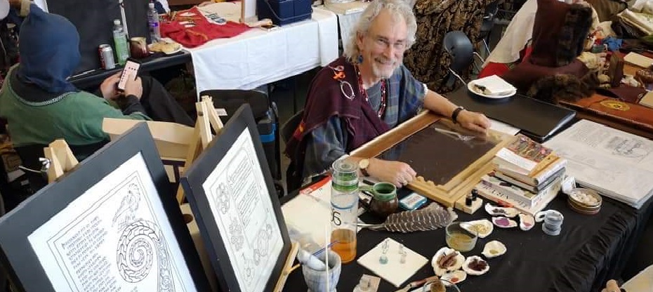
ARTISAN’S STATEMENT
HL Taliesin ap Hafgan (aka William (Bill) G Litwin)
Shire of Danesocmbe, Principality of Tir Righ, Kingdom of An Tir
Apprenticed to Dame Magdelena Kress
I have been playing in the SCA since September 2001. I have been involved in the Arts & Sciences generally and the Scribal Arts from the beginning of my SCA related activities.
Mundanely, I have been active in Calligraphy since I was 16 … so just over 50 years.
One might say that I may be just a wee bit passionate about calligraphy and my desire to introduce the art to as many people (students) as possible. Over the years, I have travelled the length and breadth of the Kingdom of An Tir teaching a number of calligraphic hands (Norse Runes, Imperial Capitals, Uncial, Insular (Celtic) Uncials, Carolingian, Early Gothic, Textura Quadrata, Prescisus, Bartarde, Fraktur, and Cyrillic).
Over the years, I have expanded my teaching to include other areas of the Scribal Arts, including: Making (Period) Quills, Making (Period) Inks, Making (Period) Pigments, Introductory Charter Design, and Illumination (Basic Painting, Diapering, Whitework & Guilding).
A couple of years ago, I founded the Okanagan Scribal (Scriptorium) … https://www.facebook.com/groups/158622164835422/ … to provide students, friends and colleagues a forum for all things Scribal. The Scriptorium is sponsored by my Branch, the Shire of Danescombe. The Scriptorium Group, maintain a files section covering many areas of the Scribal Arts. I post, whenever possible, the work of students and members, for others to see. It is also a resource for any student to seek constructive comment, advice and suggestions to further develop their work.
I have had the privilege to serve as Coronet Scribe to their Highnesses Sethric & Kolbera of Tir Righ. I am currently the Principality Scribe for Tir Righ and Deputy (Tir Righ) Royal Scribe to their Majesties Christian and Helene.
In addition, through my Scriptorium, I coordinate the distribution and painting of both Principality and Kingdom charters for any and all reigns … and have done this now for over two years. As a result, I have cultivated a working relationship with Scribal Groups and Scriptoriums throughout Tir Righ which all now support and participate in the painting of both Principality and Kingdom charters with over 30 artists scattered throughout Tir Righ who regularly paint charters.
Athenaeum is dear to my heart and I have participated since its inception. I feel immensely privileged to participate in this new incarnation of Athenaeum and look forward to the interaction and discussion with Laurels as well as chatting and sharing my knowledge to any of the participants.
Yours in service,
Good Lordship Taliesin,
I am excited to discover your efforts here (and know more about your many years and many gifts of your time and talents to others). I wish to expand my knowledge and experience with the mechanics of an Elizabethan Poet. Basically, I write a bunch of sonnets, and I usually use my laptop;-) BUT I would like to know what stripping a quill feather and preparing it for writing is like, and try my hand at making ink as well.
Shakespeare may have made his own ink. But I only guess. But I bet he stripped his own quill. Did Will.;-)
Anyway, I have your page in my notes for my further research.
Two questions –
1) Where would you recommend getting a period style pen knife (I don’t want to use an Xacto Knife as in (the otherwise interesting) https://www.instructables.com/Making-a-quill-pen/)
2) Is there much difference between Medieval Inks and inks available to an Elizabethan Poet, as far as you know?
Many thanks for your excellent work.
Brand.
Thank you for sharing your works! Your art is always such a delight to behold, and I am no less impressed by your presentation! I love the evolution of things, and the way you knitted all of the hands together was particularly well presented 🙂
Your Majesty
Thank you ever so much. Athenaeum has a special place in my heart and thrilled that I could support it through my participation. And a special thank you for your kinds words. As always, if you need any additional information please just let me know.
Yours in service,
HL Taliesin ap Hafgan
Wonderful presentation! I especially enjoyed the comparison of the various styles. The ink recipient is very intriguing, especially to my botany brain :-). Thank you for sharing!
Eleanor
Thank you for your kind words. If you have any questions or need an additional information just let me know.
Yours in service,
HL Taliesin ap Hafgan
This is beautifully put together! Thank you so much for exhibiting!
Aline
Thank you ever so much. If you have any questions, please just let me know.
Taliesin
Inspiring! Great leading subject. Loads of information. We’ll laid out. Please add commas around your prepositional phases 😉. The whole set has made me want to get back into scribal arts in new ways. Maybe flesh out the final piece on quills, with some of your anecdotal experience in cutting.
Rignach
Thank you for your lovely comments. Yes, the section on quill cutting needs to be expanded. I will make a point of taking pictures (or possibly video) the next time I am cutting quills.
Yours in service,
HL Taliesin ap Hafgan
What a wonderful and informative survey of the hands and materials of a Gothic Scribe. Your analysis of the development of the hand was very thorough and informative. I loved that you provided your own exemplars of the hands through the development. As well, I very much enjoyed the personal reflection you have done as you have refined your processes particularly related to your ink – as that is a passion of mine.
Wonderfully done! I would love to chat with you!
Inga here now properly logged in 🙂
Inga
Would love to chat with you … I love sharing my knowledge of all aspects of the Scribal Arts … as it is a passion of mine. If you are registered as a participant, I believe you can request time for a 1:1 on Saturday.
Taliesin
I have requested time with you! I hope we are able to chat 🙂
Inga
Yes, I see you on the schedule for 230 pm … looking forward to seeing you then.
Taliesin
What a wealth of information! I will have to revisit this one several times, I think! I have a long-term project to write a book based on 14th c examples and so this will help me a great deal in that. I’m still on the edge of whether I want to do this *and* try to make the ink and quill or if the project itself will be big enough without that added complexity. Might I ask if I can pick your brain further in future?
Sigga
Thank you for your comment. And yes, you can pick my brain, as you need. Also, if you are a participant you can always submit a request to set up a 1:1 on Saturday, if you would like to chat.
Yours in service,
HL Taliesin ap Hafgan