Goals

This year, I wanted to focus on learning calligraphy hands and how each hand changes the look of the same text. This experiment gives me kinetic memory of how each hand is styled and let me determine what I like about each hand.
Materials
I used a Pilot Pen (1.5mm nib) with black ink, several pages of Bienfang’s Calligraphic Paper, a sheet of Bristol paper marked with guidelines every 5/8/5 mm, a light box, and a copy of Herbert Mason’s Gilgamesh: A Verse Narrative.
My process was simple: pick a calligraphy hand and write out the first ten lines of Gilgamesh. The light box allowed me to write on calligraphy paper on top of the guidelines without reworking the guidelines on every paper.

The ductus for all hands come from Julien Chazal’s Calligraphy: A Complete Guide.
Gilgamesh
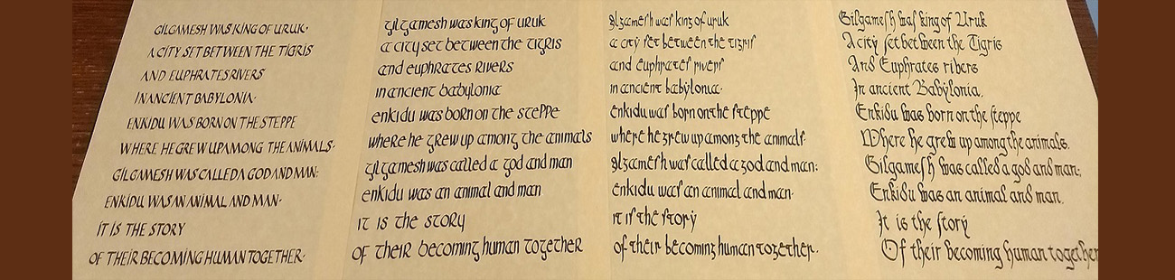
Gilgamesh was king of Uruk,
A city set between the Tigris
And Euphrates rivers
In ancient Babylonia.
Enkidu was born on the Steppe
Where he grew up among the animals.
Gilgamesh was called a god and man;
Enkidu was an animal and man.
It is the story
Of their becoming human together.
(Herbert 1970, 15)
Photos and Commentary
Roman Quadrata
Chazal says this hand dates from the 1st to the 6th centuries (Chazal 2013, 34). This is a very legible script to read as it mostly resembles modern capitals. According to the guide, I should have used a calame or brush instead of a calligraphy pen but I used what I had. The characters were easy to write although I did have trouble with the swoop on the A and all the serifs. I do not like the serifs and left them off when I could. 5/10, I need more practice.

Irish Semi-uncial
This hands dates from the 5th to the 11th century (Chazal 2013, 48). I like how this script consists of mainly of ‘o’ and ‘i’ like characters that are clear to a 21st century reader. Most of the recurring letters are easy to write with the exception of ‘a’ which takes up more room than expected. That swooping ‘t’ is nice to make but I did have trouble with the ascender on the ‘b’. It is fascinating how ‘similar’ characters in the 21st century like ‘R’ and ‘P’ are written completely different in this hand. 8/10 Would use again.

Merovingian
This is Merovingian, a hand from the 6th to 9th centuries as a precursor to Carolingian (Chazal 2013, 56). It is the first in this project to include true ascenders/descenders and minuscule text. My nemesis, the long ‘s’, makes its appearance – unfortunately it resembles the Merovingian ‘r’ too much for me to like this script. This one has nice ligatures – the ‘Gi’ part of ‘Gilgamesh’ does look good. Like Irish semi-uncial, the ‘a’ consists of two ‘c’s and takes up more room than I like. The ‘e’ and ‘t’ take up more and less space, respectively, than any other script I tried. 2/10 would not use again.

Bâtarde Gothic
Bâtarde, dating from the 13th century onward (Chazal 2013, 82), was surprisingly a lot of fun. The main stroke is a left leaning curve followed by a small swoop as seen in ‘e’, ‘n’, ‘a’, ‘g’ and a ‘t’. The stems in ‘h’, ‘k’, ‘w’, and others curve and are fun to write. This hand is very legible to a 21st century reader with the exceptions of the long ‘s’ and the ‘v’. The ‘s’ letter redeems itself with a terminal ‘s’ character that looks nothing like a Roman ‘s’ but convenes an ‘s’-like quality. The closed ‘w’ is an interested but legible choice in both minuscule and capital form. 9/10 Would use again.

Looking Forward
This was a fun project. I would like to try this passage with more hands after creating more guidelines.
Citations
- Chazal, Julien. Calligraphy: A Complete Guide. Translated by Jane Wolfrum. Mechanicsburg: Stackpole Books, 2013.
- Mason, Herbert. Gilgamesh: A Verse Narrative. New York: Houghton Mifflin Company, 1970.
I loved this! What a great experiment! I’m happy to see that you used my favorite book (Chazel) and my favorite light table method 🙂
Your reviews were fantastic and had me giggling:
“The ‘s’ letter redeems itself …”
I would love to see you try more hands and/or develop the ones you liked the best.
P.S. Bâtarde Gothic is my favorite too!
Thank you for teaching me back in 2019 and for fielding my questions this year!
Anytime!!
I love this – I don’t have the patience for most calligraphy, but I really liked your process, and your lettering is beautiful!
Very cool! Someone recommended I should at least learn how to write my persona name in an appropriate hand (Italian Rotunda), but I’ll admit I’ve been lost as to where to even begin. The fact that you jumped in and did all this — wow!!!
Thank you!
I had most of the supplies from doing my serjeantry scribal entry and wanted to pull together a larger project. Chazal’s book doesn’t cover Italian Rotunda but I believe David Harris’s Art of Calligraphy does. That, plus a Pilot Pen, some Bristol paper, and a ruler (all available at Michael’s or on Amazon) would get you started on your practice.
OH MY GOODNESS! I love it! Learning various hands is so difficult I find i often prefer the art over the hands and yet I am so in love with calligraphy! Thank you for this display and the journey you have taken us on! Also for new resource I must not make sure I have this book! I hope you keep learning hands and perhaps teach a class on those you have loved most!!!
Thank you!
Thank you for taking us along with your learning style.
I was wondering was there a reason you chose these four to do first? You mentioned that you used one pen nib, are you hoping to try these hands with different nibs to see what change that can have?
Unfortunately I am very new so not able to offer you any advice, but I will take away some ideas on how to practice. Thank you again.
The choice of hands came down to time and energy. I originally wanted to start with eight hands and expand out if there was time – clearly, there wasn’t enough time to do that ;).
Roman Quadrata had guidelines of 3/5/3, meaning the main line was 5 * the size of the nib and the ascenders/descenders were 3 * the size of the nib. Irish semi-uncial and Merovingian had the same spacing so I didn’t need another sheet with guidelines. I reused the same spacing for Batarde – which was 3/4/3 in the ductus so the main line is taller than it should be)
I knew I wanted a minuscule hand (Merovingian) and a Gothic hand – Batarde was the one I liked the most.
As for nibs, I would probably not change the nib size, especially for this passage. Going with a different nib means drawing new guidelines and the possibility of running out of paper. Ten lines in a 1.5mm took up most of a page – a larger nib more might require a second page.