
This is a casual web page (not official A&S papers) that talks about, briefly, some of the projects I’m working on. If you’d like more details, see the links inline, or chat me up! (I also talk about flags, heraldry, SCA in general, rectangular construction, the Clare/Assisi dress reconstruction, painting anything not moving, surcoats, and designing charter scrolls, just to name a few other things. And I love hearing about YOUR projects, and if you need encouragement, advice, or just want to geek out on art together, contact me!
WIP = Work in Progress
Discovery = Not the tv channel. It means I just learned about it and I want to know more about it. Just in the initial stages.
WIP: Sir Heinrich’s Codex Manesse Page
Status of Project: Work in Progress (WIP)
Goal of project: To create a commissioned original scroll for Sir Heinrich commemorating his elevation, customized to his wishes. He picked the Codex Manesse with a picture page that shows his wife and himself.
Project Stats: Started 2019 (and then everything went catterwampus)
Challenges: My biggest challenge was slowing down, taking my time, and investigating alternative ways to tackle originals. I also had to:
- Learn textura presicus
- Learn the weird tweaks to calligraphy hand specific to the Codex Manesse
- Do the smallest calligraphy I’ve ever tried
- Switch to dip pen in the middle of the project – for the first time ever
- Get a full time job and rearrange all my art time into spare time
- pandemic weirdnesses
Planning
I’ve learned the more planning you do, the better your project turns out; as long as you don’t get stuck in the planning phase forever.

In An Tir, we all have the option of commissioning a scroll from a scribe, to our exact requirements, graphics our favorite images, etc. This is what Sir Heinrich did. He hired me as to make him a peerage scroll for his elevation to knighthood. He was elevated about four years ago in An Tir, and now lives in another Kingdom.

Sir Heinrich and his lovely lady Constantia have now moved out of Kingdom but are still close in my heart, as I was lucky enough to find them and help them get started in the SCA, and we’re good friends. So of course I accepted. I turned around and “hired” my good buddy Karin Olesdotter to help me with some good period text, which she found (she’s amazing).
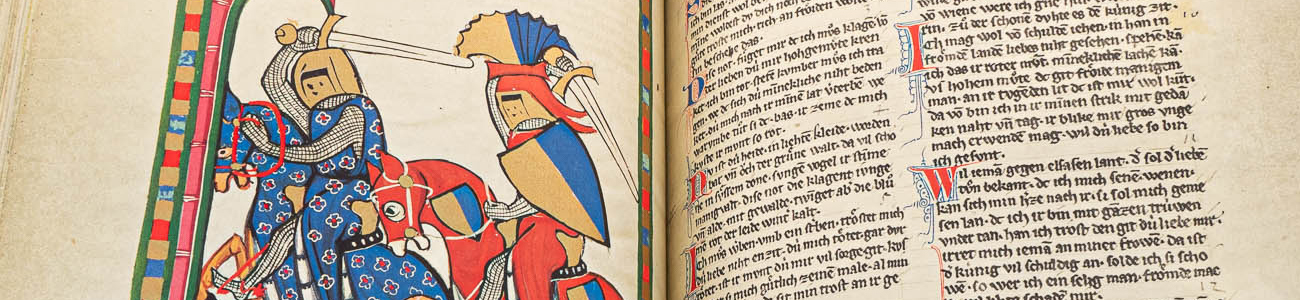
Sir Heinrich loves the Codex Manesse, a German book about love poetry. The illustrations are quite famous and all over the web. Along the way I will be adding links if you’d like to dig deeper on any of these subjects; this web page is just representing the top level information.
Codex Manesse: https://en.wikipedia.org/wiki/Codex_Manesse

It’s German, full of songs and love poetry, and the main part was completed in 1304. This matches Heinrich’s persona, too. We hit on the idea of taking a picture page on one side, and changing the figures to him and his lovely lady, and put the text on the right. The Codex Manesse itself is super famous among researchers, so I won’t go into it here much; feel free to do a web search and see all the lovely pages!
Production
Before I do any major project, I make tiny thumbnail sketches to see what we both like. Thumbnails can be any size, and I like doing them just big enough for me to get the idea but so small that they are fast to make and still very vague in the details. It’s also a test for me to see if I can actually draw that page from the source.

Picture chosen!

Next, I did a digital color test/overpaint with Heinrich’s favorite details. I put this page in Photoshop and then re-colored it and pasted on his heraldry rather crudely, just enough so we could make sure that’s where he wanted it to go.

Content of text for Award
With the inspirational graphics picked, on to the actual writing of the award and picking the calligraphy hand.
First, I needed to know what people usually said on knight elevation scrolls, so I looked up as many as I could on the beautiful scroll archive for An Tir, here:
https://antirscrollarchives.org
And then I asked the talented Karin Olesdotter if she could find something appropriate that would match our target country, Germany before it was Germany, and the time period 1300-1340 or a little around that. Oh, she did. She found a riddle. I wrote around it a little bit to get our required wording in there (date, King, Queen, award title, Kingdom name, etc) and sent it up for approval to the Kingdom Scribe, and it was approved!
Calligraphy Hand for Scroll
The calligraphy hand itself was a little trickier, which I wasn’t expecting.
All the books I looked at (ask me if you want the entire painful list) said that it was Textura Prescius. I have troubles saying and spelling that right, and after all the grief it gave me learning it, I call it Textura Precious now. (Gotta say that in your Gollum voice.) This is not a hand I knew.


Neither of these options, or the marks in the middle of these two extremes, matched what I was seeing in the actual codex pages. It seemed to be transitional, with extra marks on the feet. Look at those U letters. Little feet. M too.

I decided to model the exact marks of the actual Codex. I then set about finding out what was life size for the codex and the lettering and how that hand worked (I’ve never done T.P. before).
Tiny. Hand cramping tiny.
Step one. Copy the original hand so I could learn all the quirks. While I was at it, rearrange the letters to my text instead of the medieval German text I was using as a “dictus” (alphabet to model).

I wasn’t happy with how it looked at all, but I understood that it was a practice pass on practice paper, my second. I felt frustrated but also crunched for time to get things done by this Ath deadline. Against my better judgement, I pushed on to the final paper. I am using this:

And I had done all the ruling for the mandatory 1″ border for framing, dividing up this sheet into the left page (picture) and right page (text) and then room for the big An Tir seal, signatures, and double column text on the right side. Gritted my teeth and gave it a go.

Well, you know, this is a Learning Experience. So I will cut that big sheet in half, and use the unmarked half for a smaller original later. Waste not, want not. The calligraphy needed a serious rethink.
I decided some of the issues going on included:
- Worn out nibs on my Sheaffer cartridge pen
- Switching from practice pen to Sheaffer pen without practicing the Sheaffer all along (don’t switch tools mid-process!)
- Not enough accurate lining/ruling for my letters
- Needed an intermediate pass instead of trying to reformat AND do final pass at the same time
- Don’t do lettering when you’re super tired
I figured this might also be a message from the Universe to switch to a dip pen. I tried one when I was a kid, but I haven’t used them a lot since. Okay, take inventory, see what I have on hand, and how well it works.

Okay, resources found (that took a while), and now let’s test them out on a practice piece for comparison.

The first pen is the manuscript cartridge pen. I got it because it is very tiny in the nib in case I needed to get that small to get everything to fit. The second one is the ailing Sheaffer pen. Even sick as it was, it was still easier to move across the paper than the Manuscript. Then I switched to the dip pens. While my handling of ink was tricky because the bottles were black, so I couldn’t see how far in I was dipping my pen, and sometimes came up with too much, they still moved across the paper really smoothly. I used my set of Braun calligraphy nibs, made for people with a slightly more forceful hand.
I reached out for help and found out about the calligraphy website to rule them all:
www.johnnealbooks.com
John Neal sells books but best of all, he sells AMAZING calligraphy resources. Clear jars! I could see how far I was dipping, and they come with wood skirts so they won’t tip over as easy! And beautiful inks. And rulers! Rulers built for lining a scroll in seconds, what would normally take me hours. Okay, I put in an order, but it wouldn’t get here until this article went to press.
So I re-ruled the block of calligraphy on a separate sheet. I’ll put it under a fresh piece of practice paper and set up my “master letters” pass, get all the words in the right places and do a little work on the letter shapes.

This spacing is based off the Codex Manesse sample. The two lines close together are the height of the body of the letters. The big spaces are between the lines. It’s tiny stuff.
Next I got a big fresh sheet of Final Paper and started ruling that for the basics, such as the 1″ mandatory blank border for framing. While I’m doing this, I keep a sheet of paper under my hand so I won’t put icky human oils on my paper. It can affect how the ink and paint sink in later.
This paper does “feather” the calligraphy just the tiniest bit, but it’s not noticeable at normal viewing distance of sitting at a desk. You have to put your nose to it to see it.

And well, happy news. The John Neal cavalry arrived this morning. Obviously, this is going to be too late for this event to see the final product, but if the text works today, hopefully I’ll add that intermediate text picture.

I don’t like rushing a good art project for any reason; all the mistakes made so far happened as soon as I tried to take shortcuts.
Updates
Progress since this entry went live at the beginning of June: Three more calligraphy passes and I finally got one on the final paper without spelling mistakes. (Victory!) And I’ve also sketched the manesse picture into the left side for detailing and painting, including the border (some lines you see on this are for gutters and stuff, though).

Next is painting. Stay tuned.


Stay tuned, still in progress.
What’s Next
Okay, next is the practice sheet over my ruled sheet and do a layout pass to get my words into two columns with nice breaks for the column and the right words. This may take several passes. Sometimes you have to do this with no radio music or tv or anything. Once I accidentally wrote, while working on some charter text, “Sister Christan, the time has come…” It was so funny, I forgave myself.
So in order, next steps:
- Practice pass letters and words in right places
- Possible cleanup pass over that to make the letters look nice and resolve any issues
- Find a nice quiet time with zero cat interference and daylight, and do the final pass calligraphy on the final paper (again)
- Let that dry in the no-cat room
- Tracing paper over the illustration side, sketch the layout and figures on the tracing paper. I can make all my mistakes there and not rip up the final with erasing (this worked GREAT on the avacal scroll’s acanthus leaves)
- Redraw everything LIGHTLY on the final paper
- Paint it with the gouache
- Using an archival .03 or smaller, ink around the painting to tighten up the edges.
- If everything looks okay, seal and signatures. It may need to be mailed around, so I’ll build a custom padded mailing “box” for it with padding, foamcore (and a cut out for the seal so it won’t get squished), and cardboard over the top.
And of course, there will be a lot of photography as we go and as it completes.
What I Learned
- Learning a new calligraphy hand, be kind to yourself. It’s easy to revert to your known hand if it’s close to it.
- Slanted tables do work better for this stuff, but check the slant. Too much slant will mess up all that practice you did without any slant.
- Cat hair can float down and blur wet calligraphy ink. For some reason, I have a lot of cat hair around.
- Not all dip pen inks are equal. It’s actually kind of a personal thing.
- Sunday Night Scribes are the best!! Thank you!!
Technical skills I’ve added:
- Dip pen with Braun nibs
- Using ruling guides to rule up paper so much faster
- Knowledge of Codex Manesse
- Calligraphy hand Textura Prescius and variants of it
WIP: Lady Pegleg’s Baronial Award Gameboard
Status of Project: Work in Progress
Goal of Project: Award and gameboard merged together for nonstandard “scroll.”
Project stats: Started years ago, had some covid catterwumpus, am now active on it.
Challenges: Oh, just a few. How to:
- where to put a seal if we do a seal
- how much room do I need for the text wrapping
- how to PAINT callig text onto the board, since calligraphy won’t work
- drawing on the game board itself
- decoration theme not picked
- finding wording for the award
This scroll is a “nonstandard” scroll – it won’t be on paper, with inked calligraphy, it’ll be using other media. You can see many shining examples of nonstandard scrolls, especially cool period ones, here:
https://antirscrollarchives.org
The Award Part
An Tir Court Barony for 100, Alex. Court Barony is a recognition of someone doing SO MUCH for the Kingdom, that they are elevated to Baron/Baroness for their continuing and invaluable contributions.

Longtime An Tirian Pegleg the Merchant was awarded her Baronial elevation but did not get a scroll. I picked up the assignment and contacted her. She liked the idea of a nonstandard scroll, so she requested a game board, fully functional, with her Baronial award embedded in it. And she asked for the Royal Game of Goose, because “that darn spiral is hard to do.” Yes, it is.
Nonstandard Award Scrolls

A nonstandard scroll is not on paper, it’s on a variety of objects, surfaces, or embedded in objects. Before proceeding on a nonstandard award, make sure you have the approval for the idea from the recipient (unless it’s a surprise) and especially the Kingdom Scribe.


A quick recap of the Royal Game of Goose
Okay, I’m keeping this part short but whoa nelly, I have written chapters on this game already. If you’d like any of those documents on game play, history, and how to make your own wooden gameboard, just contact me.
The Royal Game of Goose was NOT documented by the man who is copied by all the others, who has the famous two-volume set on ancient games and their rules, H.J.R Murray. (The author Bell copied him word for word in his book of games.) So it’s a bit trickier to document this one than the normal games.
Begin – to begin is half the work, let half still remain; again begin this, and thou wilt have finished.
Marcus Aurelius
Basically it’s a spiral game of 63 spaces, with special activities marked by geese or other scenes on certain spaces in the spiral. You roll two 6-sided die to move, and you don’t get “doubles” – you do your movement again if you land on a goose. Every time you land on a picture space, even if it’s negative – you pay a coin to the center. Eventually the center has a huge pile of coins in it. The player who lands EXACTLY on 63 gets all the coins. If you land on 63 and still have some roll left, you go backwards for the rest of your turn, paying if you hit a special space.
There’s a skeleton in that neighborhood of spaces, and it sends you back to space one at the start.
Anybody can join in any time or leave at any point, it’s a rolling game. Playing pieces can be whatever you like as long as they fit nicely on the spaces.
Planning

This is going to surprise no one, but I started with… thumbnails. I made a sheet of layouts for her to peruse. We talked and settled on our favorites. And then I made a bigger mockup. The goal of the thumbnails is to figure out how to mashup an SCA scroll – not always a period-like item – and a period gameboard. Like, put the words in the border, on the edges, on the inside, wrapping out from the inside… all sketched out.

I pushed the layout and spiral design as far as I could, then I had to switch to figuring out the award text so I’d know how much design space I’d need. This stage took me a few months, that spiral is super tricky.
Award Text Content
Initially, I wrote a straightforward award text, talking about how awesome she is, and how deserving (all true). It was sent to Kingdom Scribe, per usual planning, and approved. I kept it short so I’d have design options. It was very straightforward and normal. More on this in a bit…
Production
Well, I had a big board (24 x 24″) already prepped with gesso and sanding, 3x. I went ahead and started sketching. I had to figure out a border band to carry the text, so I marked that out first, then the spiral, and that was a bear. Took a lot of sketches, erasing, doing it over, repeat. I even made little space templates to help me try to suss out the spiral.

I got it all sketched in and realized I had no theme. Whoops. I usually don’t get this far without planning a visual theme to go with it, like a color palette, or a subject matter (frogs, dragons, some sort of period reference, something). I was at a loss. I scrambled my brains for weeks trying to think of something. The problem with getting this far into production without a complete plan was just unsettling.
So finally, I reached out. I asked friends. I asked my friend/family. I even asked Peg. And then, one of my friends said it (thank you Spritzie!). She made a passing comment about Peg being a pirate. Ha! That’s it! We’ll make this board her rich pirate history… in period!! Brilliant! (Peg also loves this idea.)
Revision and Course Change
A nautical theme was born, and I started researching period tall ships, a favorite topic of mine anyway. I’d been lucky to do one before on a team effort Porte Chalice for Muirghen of Bristol. The amazing Lady Rignach did the calligraphy and I did the illumination and borders. (I like how my oak-leaf period dolphin came out!)

So I hit the books, the web, everything. This took a while, as I like to have a nice fat file of visual reference before I cook up my ideas. And then in talking with Karin, I got another great idea. (Which proves your very first idea isn’t usually your best one!) Toss out the text I had, and write her a sea shanty that sings about her award, to go around the outside of the game! Love it!
And then I thought… how do you write a sea shanty? Oh yeah, major rabbit hole warning. Just google it. There are hundreds if not thousands of sea shanties and hundreds in YouTube to listen to. Basically, not being an expert, I figured out just enough to get this project enabled, but basically it’s a rhythmic song used by people on ships to help keep a beat and pass the time.
More weeks and months went by as I revised the plan and then one night, I grabbed a post-it note and just wrote the entire sea shanty in one go. (I don’t know how I did that, chocolate was not even involved!) Not posting it here because Kingdom Scribe has not seen or approved it yet (I’m sending it after I fix the last phrase). Stay tuned, please.
Sketching, sketching, over the sea and main
So the board got the center sketched first. That’s the beauty scene, the one to sell the whole thing. I consulted about 40 pictures of tall ships in period. I think the sketch went great. Next I am sketching in gulls for the geese spots… we can all yell “Mine!” every time you roll the numbers and land on one. And then I’ll sketch the specialized spots for gameplay, and lastly, the regular non-reactive game spots. I’m still debating what to repeat in those, but I have some ideas burbling in the back of my brain.

Then I sketch the corners and it’s paint time! I’ll need to test a palette first on a separate piece, make sure I don’t muck it up as I go, but I’m going to do the inside in full late-period scenic realistic, and then simplify to 4 color limit for the rings decorations, and pop back to full realistic scaled palette for the corners. That will help the game stand out a little and give the eyes a rest.
The repeating non-action design could be a compass. I sketched out one and then realized it was way too complicated.

Words, words, words
The words will be tricky. I need to calligraphy them first, on a separate piece of paper. I like to make at least three full passes at the entire thing to get the letters spaced right with the right heights. Then I’ll need to draw the outlines of those letters onto the board itself, and paint them in. I’m not quite sure how I’m going to pull that off, but I’ll think about it while I’m sketching in the rest of it.
I also need to settle on the appropriate calligraphy hand to use for a late period, ship-related scroll with a sea shanty/award on it. (Welcoming suggestions on that one!)
Seals Ahoy, Matey

So the An Tir Kingdom seals are quite large and magnificent. They are also thick wax. If I stick one to the board, it will inevitably break off, shatter, or otherwise get harmed. I don’t want to carve out a cavity for it either, that would be weird and hard to seal later.
I’ve decided to faux paint one on, for the fun of it. I’m going to put it under specific lighting so I can get all the pretty wax highlights and then paint it, on paper first for practice, then on the board, so that it’ll be an illusion of a 3D seal. If it works, great!
Won’t know until I try!
Set Sail
After the entire board is painted, decorated, calligraphy added, and faux seal approved, then it gets sealed with polycrylic, which will preserve the paint against sunlight, rain, and light dings… and it gets packed up and taken to Peg.
What’s Next
A long list, but I’ll try to condense it:
- Resketch the spiral a little to round it out a little bit more.
- Sketch in the repeating designs and special squares.
- Finish the sea shanty, send it for approval, and then after that, write it in calligraphy and then copy that by sketching onto the border of the board.
- Paint, paint, paint. Tests will be done on coasters to make sure the palette and the ideas work.
- Paint sides and back to prevent warping.
- Seal everything and then deliver it to Pegleg.
It’s going to take a while because I don’t want to rush a good piece of art; and I have cats to dodge.
What I Learned
Your first idea is not necessarily your best idea.
Tall ships are still cool.
Putting a sheet down to protect pencil marks from your hand means less erasing later, as they won’t smear as bad.
Bigger game board size is easier.
Discovery phase: Roman “tiled” patio
So here’s the thing. I am starting to plan my jungle-taming landscaping around my house. And I have no decks or patios. I was just rolling ideas around my head until I saw this video on the internet:
This is gorgeous. I want this in my backyard. I have no idea how to go about it – I wouldn’t know a tesserae if it bit me in the ankle.
https://www.facebook.com/149024345264116/videos/330300021779372
The original video is over a year old. This last link is 8 weeks old. They’ve uncovered nearly all of it. The video is in Italian.
Update: This is an Italian drone-shot video of the progress on the site. Great for capturing stills. You can see the tesserae up close. This group also has a Facebook group with updates.
The project is listed here as an open call for all Roman patio-interested people to geek out together with me on this and anyone with patio, paver, concrete, concrete molding, or similar applicable knowledge to please reach out and geek out with me.
Some quick visuals


The target area is my backyard, a space that could be as large as 50 feet by 100 feet if we chose (I recommend 50 x 50 for this). These things tend to be square or rectangular. The target area is overgrown and would need some prepping.
So that’s all I have so far. Any advice or pointers would be most helpful. Thank you!
General Notes
Due to the impact of some recent Real Life, if anything is missing from here that you’d like to know more about, just reach out and talk to me. I love geeking out with my friends on these things.
Special thanks to the Sunday Night Scribes inter-kingdom zoom sessions – y’all rock – and to all my friends, I couldn’t do this without you. Hugs and eternal thanks to my Laurel, Mistress Aryana Silkenfyre, and to Duke Thorin Njallson (you are still inspiring), and my Archos (archery coach), Torn of Froghaven.
Scrollwork is best done by a village, and I have the Barony of Aquaterra to thank for all their help and support (especially Baron Geirleikh and Baroness Zahra), and my deputy Karin Olesdotter, who is tracking what went where and finding really awesome period texts for the originals project; Rowena of the Jade Isles, a poet, who is helping with the texts for our charters and much more, and finally to the multitude of friends I have in the SCA, you are all most awesome and I can’t wait to see you again in person.
Also, email me if you need the link to all the Scribal Bookmarks that you can color.
DeunanB (at) gmail (dot) com
Wonderful exhibit – I love seeing people’s WIPs because it makes me feel less alone that my own stuff isn’t really ‘done’ ^_^ And I love the board game award! It’s such a cool idea 🙂 Your work is fantastic, well done!
Enjoyable, informative, and inspiring! Thank you for sharing your projects and processes. -Arlys o Gordon, OL, OP
Fascinating exhibit! Thanks for creating it and sharing. You have inspired me to pay more attention to what I do with my thumbnail sketches; that is, no more scraps of paper, and use a book already. Thanks for that, too!
Appreciate the detailed discussion of the hand for the Manesse Codex scroll, and the image you settled on. I did a copy of a miniature from that source, but have never tried to write the hand from that. Yes dip pens are worth it, and finding the right nib is crucial. Thanks for sharing.
Thank you! Famous book to use as source; the calligraphy is really weird but I’ll get it. Dip pens, with the right tools and ink, are so more artistic. 🙂
I would love to pick your brain on some of your scibal supplies and must haves, as well as artistry and design! Additionally I never considered game board making something that might fall into a sribal world! I love this! I am so inspired now to consider making a game board! Thank you for the inspiration!
Sure! Happy to share. You can make a nonstandard scroll out of darn near anything, so game board! Sure! It’s going to be really colorful in a bit after I get to the paint stage. Happy to share more info however you’d like to do that.