How to Tell an Artful Lie, Truthfully
All maps, even especially good and useful maps . . . are a lie.
It is my intent to convince you that this statement is accurate.
To understand why this is the case, we need to understand what a map is, how they are made, and how I have applied these elements in the maps I have been making of SCA lands for over 15 years.
But first, a modern example of a truthful lie.
Maps tell graphical stories. You need only look at the classic “Red vs Blue” map of US states during an election to understand this fact.
Frequently, maps of partisan voting are shown at the state level, with whichever majority won the state’s electoral votes classifying it as being either a “red” or “blue” state, which corresponds to Republican or Democratic voting. However, if you display the same information proportionally, showing it as non-binary data, you can see that blue and red states are not monolithic with respect to voting patterns. See below for examples of both maps. Note that both maps are telling the truth, and a lie, at the same time. (https://tinyurl.com/y56kz4kg)

Updated: December 2, 2016-Accessed 7/4/20)

Updated: December 2, 2016-Accessed 7/4/20)
What Is a Map?

To begin, we need to establish some definitions.
A map, as defined by Merriam-Webster is: (https://tinyurl.com/yapzla93):
- A representation usually on a flat surface of the whole or a part of an area
- A representation of the celestial sphere or a part of it
- A diagram or other visual representation that shows the relative position of the parts of something
The first and last bullets are the most relevant for the types of maps I am going to discuss, which are representations of the Earth’s surface (at least until the SCA gets a foothold on Mars!).
Before, during, and after the SCA period, maps served a variety of functions.
- A Story Told With Pictures
- A Way To Navigate
- A Way To Show Relationships
- A Way To Show Power
- A Way To Better Understand Our World
Historical Maps
Although there are innumerable excellent examples of the wide variety, and often surprising accuracy, of early period maps, I have chosen two examples to highlight how maps can be a story told with pictures and a way to navigate. The earliest map that I am aware of dates to over eight millennia before today, and is great example of a story told with pictures.
Çatalhüyük Map
This map (below) is from a 9′ long wall painting from Çatalhüyük (Turkey). The map has been carbon-dated to approximately 6200 BC. The map was rediscovered in 1963, and the re-discoverer believed it to depict the layout of the city of Çatalhüyük, with an erupting volcano above it. There has been a great deal of scholarly disagreement regarding whether or not the map in fact depicts an erupting volcano, but recent discoveries of volcanic rock in the area from the nearby volcanoes, from approximately the time period in which the map was dated to, provides support for this assertion.
If the scholars are correct, then this map graphically depicts a vitally important event to the people that lived in that area in that time.
(https://tinyurl.com/ya39dbzx)

Dauphin Map
Sailors frequently created coastal maps to guide them in their navigation along the coasts of large land masses. They used those maps to find safe anchorages, sources of fresh water, and then to find their way home again.
The map below demonstrates the types of information that would be important to a sailor and trapper in the 1500s, showing in pretty good detail the eastern coast of North America, with its inlets and major rivers.

Source: Dauphin Map of Canada – circa 1543 – Showing Jacques Cartier’s discoveries. Public Domain – https://commons.wikimedia.org/wiki/File:Dauphin_Map_of_Canada_-circa_1543-_Project_Gutenberg_etext_20110.jpg Accessed: 7/4/20
Brehon’s Adventures in Cartography
I will demonstrate the last three functions of a map: a way to show relationships; a way to show power; and a way to better understand our world, with maps that I have created.
But first, I will tell you the background that I have and the path I have traveled to create these maps.
When I was in college, I took a number Geographic Information Systems (GIS) classes. Put simply, GIS is the science of using a geodatabase to spatially understand and describe the world. It is a widely used tool in much of the natural sciences, and it is an important part of the career I was pursuing.
After college, I found many instances in my professional job where using GIS was immensely useful, and I had the occasion to teach GIS and cartography (the science or practice of creating maps) as an adjunct professor at the college in Bismarck, North Dakota for a number of years.
In addition to being a natural resource professional, I was also in the SCA, and it seemed natural to me to see if I could blend my long-held love of maps with my professional skill-set to create something interesting, useful, and, hopefully, beautiful.
How The SCA Does Territory
To understand GIS in the context of the SCA, you need to understand how territory is “claimed” in North America (the Old World, and the kingdoms of Drachenwald and Lochac being different).
Territory in the 18 kingdoms of North America is almost always sorted based upon zip codes or their Canadian equivalent, postal codes.

One of the first SCA maps I made. This was done in PowerPoint, based upon web content I found, not the GIS software I use today.

Once I discovered this, creating geographically accurate maps seemed a simple and straightforward matter of getting those zip or postal code shapefiles (a file format used by GIS that provides a precise, geographically-defined location for polygons), and figuring out which zip or postal codes belonged to which group, plugging that data in, and VOILA!, I would have a cool map.
Of course — a fact probably familiar to most of the folks reading this — like most seemingly simple tasks, once you start digging into what those tasks actually entail, it becomes clear that you have an ever-increasing level of complexity and nuance to get to your “simple” answer or product.
The first data-based challenge that I faced was that zip and postal code shapefiles were not always cheap or easy to acquire. Especially in the case of Canada, where much seemingly public data is not freely or easily available to the public.
I spent about six months tracking down free, relatively accurate shapefiles for both countries (there were no SCA groups in Mexico at the time).
Once I had that information, I ran into my next obstacle; granularity and accuracy.
It turns out that the folks in the SCA, in the pre-GIS era, often did kingdom/group territories with, at best, a spreadsheet and a rough idea of which zip or postal codes belonged to which state/province/region.
Unfortunately, the fact that folks weren’t using the visual medium of a geodatabase to “truth” their territories resulted in a lot of obvious inaccuracies.
Things like non-contiguous group territories (within and between kingdoms), changing zip/postal codes (they change over time, in response to population shifts), kingdoms which crossed the US-Canada border (An Tir, Northshield, and East) where the different countries were using different kinds of geodata, areas like national parks which have unique zip codes, etc. . . . all contributed to a great deal of inconsistency and obviously wrong data.
An Tir Territorial Map

An “ugly” map of An Tir’s territories, with the shapefiles of the zip or postal codes classified by group.

This is what I came up with when I first created a territorial map of An Tir, using the zip and postal codes for the kingdom. Obviously, this map is very busy. The colors correspond to groups, and you will notice many areas where similar colors are not contiguous, indicating “island” territories. I include it to give you an idea of what my “raw” maps look like. My version of a map of An Tir in the next paragraph is the result of a fair bit of clean-up and editorial decision-making on my part. (Click the image to see a larger view.)
An Tir/Artemisia Kingdom Maps
These are two of my finished maps of the kingdoms of Artemisia and An Tir. Compare the borderlands between the two kingdoms. You will notice that the kingdoms claim overlapping territories. These kinds of inconsistencies are a regular feature of SCA territories.

A territorial map of Artemisia. Note the western border, and how it differs from the eastern border of An Tir in the next map.
I spent another six months cleaning up the geodata, with the hope of ending up with a “clean” map that made sense. At this point, my interest in maps caused Northshield to offer me the newly-created position of Kingdom Cartographer, which seemed a fun fit, given my interests.
In my new position, I went about “fixing” the kingdom’s internal group boundaries; resolving obvious errors and setting up what I hoped would be a useful framework for managing group boundaries within the kingdom. I discovered that an average of two groups were being created or dissolved every few years, so trying to ensure that the boundaries stayed “clean” was a regular task. The gradual changes in zip codes (population change, driven by the census) created an ongoing data accuracy challenge.

A territorial map of An Tir. Note how the eastern border of An Tir differs from how the Artemisian map prior to this one, depicts the border.

Turning A Workhorse Map Into A Pretty Map
Now that I had figured out how to make the maps accurate, I set my mind to trying to make them beautiful.
Unfortunately, I am not gifted with great artistic instincts, so I did the next best thing and found examples of obviously beautiful maps in history and fiction, and shamelessly emulated them.
This step took me a LOT longer than the database step. My maps went through a LOT of iterations, before I felt that they were no longer as ugly as an old boot.
I am sharing with you, reluctantly, several examples of how my maps improved over time. (Click on images to see a larger view.)

One of my first maps of Northshield.


This is also one my first maps. I overlaid the kingdom boundary, over simplified elevation data.


A map of Northshield after I had started to incorporate graphic elements that I felt improved the map.

My maps did get better, but they still felt like they were lacking that “magic” element that would make them feel like they truly captured what I consider to be the essence of the SCA — a joyful mix of historical, fantastical, and organizational elements.
By about 2010, my maps had started to look more like what I wanted, as I started adding additional personalized and artistic elements that gave my maps the “look” I had been aiming for.

My first “pretty” map. I was pretty happy with this look, and largely kept it the same over about a decade.

At this point, I started challenging myself by trying to achieve the same look for other kingdoms, especially those adjacent to Northshield, and then to create “one off” maps as gifts for special moments, like a friend getting vigiled for chivalry,

A map I made for a good friend, upon his vigiling for chivalry. The maps depicts Calontir, but I also put the locations of the “milestones” of his SCA career; awards, where he won crown, the site of his coronation, as well as his vigiling and knighting (becoming a Master).

a shire becoming a barony,

A map I donated for a fundraiser, to some good friends in the Shire of Bronzehelm, upon the investiture of their first baron and baroness. An artistic element I really had fun with, was the tree in the lower right hand quarter. The tree, depicts the “life” of the group, from the founding members in the roots, the major kingdom changes of the group in the trunk, and then the members, depicted as fruit, at the date of the investiture.

the creation of a new kingdom, or by showing all of Northshield’s monarchs as a part of a Northshield map for the 50th anniversary of the SCA (from principality through kingdom, current to that year).

A map I made of Northshield, for the SCA’s 50th anniversary. The border of the map, contains pictures of all of Northshield’s monarchs, from principality, through kingdom, done in a Bayeux Tapestry style, but personalized for the things that those monarchs were known for. In addition to a paper map, I had this printed off on a giant piece of linen-cotton, and made a 8’x5′ backdrop for the sitting royalty.

It was at about this time that I moved to An Tir.
Beyond the fun of meeting new people, attending new events, and learning new SCA customs, I was also excited to tackle a new kingdom’s map.
After getting access to the zip/postal codes thanks to the Kingdom Seneschal, I quickly did a cleaned-up version that conformed to the basic style I had developed in Northshield.
An Tir Territorial map.
But now I wanted to tackle something new and more challenging.
So, I decided to get out of my digital comfort zone and create a paper map — completely by hand.
A Digital Cartographer Goes Analog
Once created, a digital map — which does require many hours of computer labor, as well as specialized skills and software to produce something that looks nice — is actually pretty straightforward to re-create through various iterations. A paper map, however, was a challenging and interesting new project.
Unlike ancient explorers and mariners, I had the advantage of already having my own geographically accurate maps to draw upon. However, I wanted this new project to reflect the artistic license and minor inaccuracies of period maps.
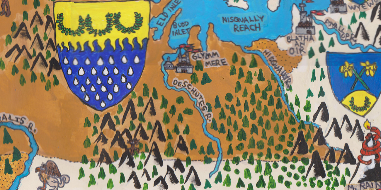
As my subject, rather than the kingdom, I chose the territory in and around the Barony of Glymm Mere. As our Baron and Baroness were soon to be stepping down, it seemed like a good “time and place” to capture in a static map.
So, I decided to largely create the map from memory, with a few cues from looking at a printed map. Think of it like drawing a map based upon stealing quick glances in the court of a foreign land.
Creating My Baronial Map
Planning and Materials
I chose large sheets of 100lb vellum, and used a regular pencil to sketch out the barony and its surrounding environs largely from memory, trying to minimize my references to my existing maps whenever possible.
I chose the general size and shape based upon maps I had already done, and the sizes of picture frames generally available. Although I could have “zoomed” into the barony as tightly as possible, I decided that the map would look a lot better with the entire Olympic Peninsula depicted, as well as the major baronies part of the way up the Salish Sea.
Sketching in Features
Once I had the general outline of the region, I started to pencil in the territories of Glymm Mere and the other groups within my map “frame”.
It was useful that many group boundaries in An Tir correspond to real rivers, which served as a useful placeholder for those features later. Nonetheless, inaccuracies started to creep into my map, which I saw when I compared it to my printed version. Although these inaccuracies would normally drive me to distraction in a digital map, I was trying to stay true to the process, and ignored them.
With the territories finished, I turned my attention to the geographic features such as major rivers, major mountains, etc…, penciling in their location and general shapes.
Now I had a pencil map that was bit messy, but one that I felt was balanced, with enough room for the details I wanted without requiring super detailed work, which would have proven beyond my skill level.
I left about an inch around the border of the map for a simple knotwork design, which is an element that I have included in my maps almost from the beginning.
Painting
At this point, I took a deep breath and started using acrylic paints to fill in my map, broadly getting the areas colored.
I must confess that coloring and balance of those elements is not an area that I am strong in. In a digital map, this isn’t much of an issue because I can play with many different combinations at the click of a mouse.
I chose a tan color for Glymm Mere’s territories, and an off-white for the other territories, excepting the Crown Lands (lands not claimed by a group), and the logical blue for the water areas (including rivers).
With the basic work done, I turned my attention to the where and what, in terms of details, I wanted.
Adding Heraldry
I knew that I wanted to depict the devices of all of the groups, with Glymm Mere’s being the largest, to emphasize that the purpose of this map was to showcase their lands. I needed to place them in a way that left room for the icons I wanted for the group’s “fortresses”. I generally chose the biggest city, as the fortress for a territory. Admittedly, when considering the large and contiguous settlements along the I-5 corridor in Washington, these locations are somewhat arbitrary. I did toy with the idea of putting city and fortress structures all along the interstate north of Olympia, but rejected it as being too busy.
After I roughed in the group devices and group fortresses in white, I sketched them out in pencil. I also penciled in the title of the map.
I painted these various map elements with more acrylic paint, although I discovered, to my consternation, that the lighter paints were not very effective in covering up the pencil marks.
Filling the Empty Space
Now I had the general map in place, but I needed to fill in a LOT of empty space.
For this, I chose to put mountains and forests, in the general areas that Google Maps showed them to be. But I made sure to put a large mountain where Mount Olympus is located, and also Mount Rainier, as they seemed to balance the elements of the map, and because of their relative importance.
At this point, my map was painted, but it was pretty rough.
Outlining Boundaries
I decided to use an ink pen to give nice, clean boundaries to the painted images. In most cases, this worked as I wanted it to. However, in those areas that were lighter colored, the ink had a tendency to bleed outside of its nice, clean boundary, leaving me with a rougher line. I also discovered at this time that errant drops of water caused the ink to spread out rapidly, to my dismay. This required a fair bit of nitpicky clean-up.
Bestiary
Next, I started penciling in a bestiary that seemed characterful for the region. I chose orcas, using a Native American look, wild men as surrogates for sasquatch, a few more natural animals, and then the more typical, “Here There Be Dragons” type creatures, and finally a few boats, to highlight the strong nautical shipping tradition of the region. I penciled in, and then inked the names of various water features, putting more detail in and around Olympia, or picking out larger bodies of water. My reasoning was that people tend to have more detailed knowledge of the areas nearest where they live, thus the smaller inlets and rivers nearby should be included in a map of this type. I also added building features that typified the area, like the lighthouses in Caladphort and Druim Doineann, the Space Needle in Madrone, and the Capitol Dome in Glymm Mere.
Title and Labels
I used ink for the title letters and added a gold acrylic center to each letter. While cleaning up some of my inevitable paint drips, I accidentally used a lighter shade around the title letters. I liked this look so much that I decided to use it throughout the map, wherever there was text. I think it greatly enhanced the legibility of the map.
All that I had left at this point was the remaining 5% of the map. As anyone who has ever done a project knows, the last 5%, takes 50% of the time. The work was finicky, and fair bit of cursing was heard in my immediate vicinity as I grappled with ink, light-colored acrylic paints, and that curse of a left-handed person, the fact that we write left to right, thus smearing anything beneath our hand as we go.
Finishing
Despite those travails, I eventually got the finish work done, and I sprayed a clear coat on the map to keep the ink from running again.
After this, I scanned the map, and outputted the image as a jpeg that was not too large of a file for this website. If you notice any edge irregularities in the scan of my finished map, it is due to user error, when I assembled the smaller images into a larger whole.

A painted map of the Barony of Glymm Mere, and the surrounding environs.

Lessons Learned and Next Steps
This was my first map done entirely by hand, and I learned several lessons (otherwise known as “Never Do This Again!!!), and came up with some ideas for my next mapping challenge.
First off, I will find a different kind of ink pen, or perhaps use a super fine brush for detail work next time. Given the “bleedability” of modern ink pens, I need to either find a better way of inking lines, or I need to do it perfectly the first time. Option “A” is significantly more likely.
I really like how this map turned out. I enjoy the balance of the image, and rather than finding the inaccuracies inherent in a hand-drawn map distracting, it let me focus on the balance and theme of the map by tweaking the location of areas, such that they looked more interesting.
For example, given the area this map encompasses, Mount Rainier should not appear on it. That being said, I think including it was the right choice, as historical maps could “relocate” or distort the sizes and locations of important map geographic features in order to “frame” the map well for the desired audience, and incidentally, make it more artful.
I have been thinking seriously about creating a travel map, akin to what mariners made, where, after the Covid lockdown ends, I will sketch the important features that catch my eye as I travel (in the passenger seat) throughout the kingdom. I am really curious to see how the map turns out, and how it compares to the geographic reality.
Another experiment I would like to try is creating a T-O (Orbis terrarum) map. In period, a T-O map divided the world into three parts: Asia, Europe, and Africa. Asia was depicted on top as the birthplace of Christ and the original site of the Garden of Eden. In a map of this type, the center of the map was the most important map element, and north was not always up, as it is in modern maps. Instead, important (to the audience) features are highlighted, and less important features are greatly distorted. A friend made me a T-O map of Northshield many years ago, and I think it is really cool.
Whichever route I choose to travel next, you can be sure I will use a map to tell an artful lie, truthfully.
Sir Seumas,
Such great work you’ve done! My youngest has asked me to DM a D&D game for him and his friends. I decided to make a homebrew world based off of the map you gave me years ago of Northshield. I’m calling this world Scadia with households and kindgoms inspired by the SCA dream. Distance in this land is based roughly off of hours to days meaning 4 hour drive in our world is about a 4 days journey in the land of Scadia.
Thorbjorn “Thunderbunny”
Greetings!
I just found this! You are to be congratulated, Sir, for your patience and dedication to such an art. Will copies be made available? It would be most entertaining to ask a friend (not in the Society) to them where we have travelled to using one! I have an idea for travel maps for the Society, like the ones with stickers to show reach place visited or lived in. A dear friend, who is a teacher, mentioned the idea and I thought I would pass it along.
Thank you for doing this…Bright Blessings to you!
Greetings! I have been slowly working my way through the exhibits, and also caught your class hosted by Disa (after the fact, so very glad for youtube!). This is wonderful! I have an affinity for maps myself and have worked with GIS to a small extent.
I noted the comment about ‘here there be dragons’ which I had to laugh at, as I was wanting to make a map of my local shire, and we do have a small local airport where I was going to write exactly that!
When making SCA maps, do you ever find you want to label something that doesn’t have an accompanying SCA name? So, territories have SCA names, but what about rivers and roads – does the SCA have any kind of standard naming policy for either natural or man-made elements that might be labeled on a map, or have you ever applied medieval appropriate names to local geography?
Which sort of leads me to my next question, did maps ever utilize any kind of pictographic or “pun” type elements? For example, to indicate a local town called Bow I was going to draw an archer. Is that something that was ever known to be done in period?
I am very sorry I missed the chance to talk to you during Athenaeum but I am glad I got to your exhibit and saw your presentation. Thank you so much for sharing this!
Thank you! 🙂
In respect to non-strictly SCAdian geographic features, that is an excellent question!
I’m not aware of any firm rules, but in general, I’ve used the latin word for certain feature types (lacus for lake, etc…) for mundane geographic features I use in my maps. 🙂
I’m not aware of it (pictograms), but I suspect it depends on the intended audience. For a literate audience, words might be easiest, but if you’re intending it for non-literate, pictograms would likely be smarter.
This was fascinating.
Thank you!
Thank you! 🙂
I have always loved maps and so enjoyed your project! Thank you for sharing it in such detail with us. Let there be marvels and wonders–and directions! 🙂
Looking forward with great anticipation to your continuing exploits into medieval mappery. 🙂
Thank you so much for your kind words! 🙂
I really enjoyed reading about your work. I am a map fan of a different style, and have given a class at Collegium on historical map designs and techniques, and how to adapt them to make your own map for an event or site or branch. I would love to talk to (message/email/…) you more about maps. I have also been contemplating initiating a community of mapmakers of the SCA. Maybe a Facebook group, maybe something else.
Excellent and thank you! 🙂
If your ears were burning about 3 hours ago, it’s because Spike Zoetaert was talking about your work in cartography, and how I should definitely reach out to you!
I’m absolutely interested! Friend me on FB (or email me at seumas_mac_brehon@yahoo.com), and we can scheme on your excellent idea for a mapmakers community. 🙂
I saw your presentation at Collegium last fall and really enjoyed it. With that context, it’s really great to see your path to where you are now. I think we forget that our art can take years to grow and develop and seeing your timeline helps me have some patience with myself. I admire how you keep challenging yourself a bit more out of your comfort zone each time. And I loved the phrase “shamelessly emulated them” – I see no problem with that, one of the best ways I learn art is to emulate others until I feel comfortable that I’ve learned enough theory to branch out.
I’m really impressed with the thought put into your physical map and with your jump to what seems more out of your comfort zone than even before. I adore the idea of wild men as Sasquatch and the creativity of that.
Thank you for sharing!
Thank you! 🙂
Yes, I agree 100% on the need to have patience about the learning process.
It’s why I wanted to show my early maps, to give folks a view of the distance they’ve come, and hopefully, how far that they can still go. 🙂
Your work is fantastic. I’ve always loved learning about the ‘science’ behind art forms, and this was really interesting to read. Thanks for sharing! I hope you continue your work.
Thank you very much! 🙂
Your work is exquisite and I look forward to seeing more of it.
~Dame Elizabeth FittzWilliam. OL
Your kind words are very much appreciated! 🙂
Hi Sir Brehon, My name is Andrew, and I was a Geologist for DNR in Louisiana, I was getting a Masters in GIS from The University of Denver. I have done a lot of work making maps, and I live in Glymm Mere. I’ve even done some subsurface mapping. I had no idea we shared a similar passion. Your maps are beautiful by the way.
Andrew Lewin
Thanks! A lot of years practice, and the guidance of a REALLY talented cartographer at my previous job.
Greetings from Edward Ean Anderson love your work. I would like to talk to you some time soon and ask for your help in creating a SCA War game map. I am currently the kingdom war lord and have been working to understand the program vessel it is a online game engine that any game can be played on and have been thinking how to adapt it for SCA wars on line.
Thank you for youe time keep up the goods works
That’s a really cool idea! Shoot me an email at seumas_mac_brehon@yahoo.com, and we can talk. 🙂
This is my new favorite map of Puget Sound. Well done!
Thank you! 🙂