A Quick Recap

Where We Left off….at Athenaeum 2020 I presented work I had begun on a project to create a series of Shakespeare character costumes. My focus last year was the Cleopatra design. This year I am presenting the Calpurnia design as my main focus. The unifying thread in all of them is that they are designed and executed to tell a story, of a character, a persona or a relationship. Clothing tells a multitude of stories about the wearer and my goal here is to share the thought process behind the choices I make to tell those stories. Clothing is more than simply what we wear. It tells others how we think about ourselves, how we want to be perceived, who/what we are connected to, how we want to be remembered. I want to share some of my story telling tools with you here as well as some of the things I have learned along the way about how these types of stories were told in period (1570-1615 London)
Comparing Calpurnias
So who is Calpurnia in Shakespeare’s Julius Caesar?
I think its important to differentiate that the Calpurnia from history and the woman Shakespeare depicts in his play should be considered as two completely separate individuals. Shakespeare was not an historian, expert antiquarian researcher or archivist. He was a businessman seeking to make his, and by extension his family’s, fortune. For as much as we have permanently attributed the words, motivations and personalities of Shakespeare’s historical characters to their actual inspirational counterparts, they are still fiction. So in seeking to create my Calpurnia for this murder mystery/Shakespeare themed event, i felt no obligation to be any more faithful to actual ancient Roman research than Shakespeare himself. What I set myself as the task was to create a character design that was reflective of the fashions in the year the play we debuted at the Globe and also taking into account the level of fantasy and whimsy the Elizabethans and Jacobeans embraced in their celebration and masque costumed frivolity.
Calpurnia is Roman, a Patrician, the wife of Caesar. By any reckoning she is an important person in the social structure of Rome in Caesar’s world. In effect, she IS (all be it briefly) the Queen of Rome (the empire, not just the city). Despite that, Shakespeare gives her a scant 10 minutes of stage time in the play. She is trotted out rather late in the play, just before (spoiler alert) Caesar is assassinated in the forecourt of the Senate chamber, and she only has that one scene to make an impression on the audience. Sh has to have a strong enough presence that the audience will believe that, but for the intervention of Brutus, she’d have succeeded in convincing Caesar to forego the Senate that day and thus avoid the assassination. Sh has to look strong and commanding. Bear in mind she was played by a boy between 14-19 years of age….opposite more seasoned actors of more mature age and experience. So to my mind, this means her attire must be imposing and commanding from the second the enters the stage.

This is the final design I settled on for Calpurnia, (Please excuse the stupid calligraphy error I need to fix, this is why you don’t do text layout late at night) but there were definitely several early versions before this was approved by my instinct-brain as the correct choice for my needs. So let me break down the images that I drew on as inspiration for this piece as well as show the evolution process that Calpurnia went through to arrive at this point. The style motifs of the clothing are pulled from portraits of prominent women connected to powerful Catholic leaders in Europe at or before the time of Shakespeare. Most Londoners had zero clue what an ancient Roman person would have worn, so to distinguish the characters as being “from somewhere else”….aka Rome in the case of Julius Caesar…. I tried to think about how the average middle class Londoner would think of people from Italy.
Inspirations
Italy at that point is synonymous with Rome, The Pope, and occasionally The Holy Roman Emperor. So I looked for prominent women connected to powerful catholic husbands within those spheres who also had notable style traits associated with them….and they are who I amalgamated Calpurnia from. I confess to dipping into a bit of actual Roman iconography with the hairstyle….the Flavian fontage of curls is so similar to the wired up mountains of hair that Anne Of Denmark and her ladies favored that I just couldn’t resist.

I chose this portrait for two main reasons (visually). On a contextual level, Maria Enriquez de Toledo y Guzman (by the time of the writing of Julius Caesar) had been Duchess of Milan, Vicerina of Naples, Queen of Portugal and wife of one of The chief advisors to Charles V ( Holy Roman Emperor) And his successor Phillip II of Spain so she was a notable figure in Italian/Catholic culture in Italy and main-land Europe and her likeness may have been recognizable to members of Elizabeth’s court who had traveled. On a purely stylistic level, I have long loved the “linguine oversleeves” Mor uses in this portrait ( and also in a portrait of Elizabeth Valois, Queen Of Spain). I made an attempt at them a number of years back but was unsatisfied with the result in both scale and appearance, so the chance to revisit them felt good. I like them as a way of quickly “othering” Calpurnia as not English because they are a style you see nowhere in any English portraiture of the period. The other component I was intrigued by was the “partlett” that has applied cording and pearl trim on both the yoke and the sleeves. Again this is a trait you don’t see in English portraits of this period so it made a very strong impact on my visual brain. But those were not enough, to be able to stand next to Cleopatra and hold her own, the graphic nature of Calpurnia needed to be bolder, so I kept looking for another strong visual element to really anchor Calpurnia. And then I remembered the other portrait that has been nagging me for the better part of 15 years.

A good friend of mine who is no longer with us, Mistress Anabella de Cherubino of East Kingdom, and I had a long standing open debate about the “how” of this epic gown depicted by Romano in the painting. Before she passed, we had debated the knot-work being actual interwove manes of cloth, a single piece with voids cut away and trim applied to create the illusion of interweaving, panels of cloth with the voids cut away and trim applied to mimic interlacing knot work. We ultimately figured it most apt to be that last concept as that would allow for the most efficiency in the production process. Then we debated if the “web” was a free floating layer or if it was tacked to the layer beneath it, or possibly mounted on a sheer layer. In the end we decided that based on the information in the portrait, it is intended to be read as an independent layer of webbing not mounted on either the solid dress beneath it or a shear layer of fabric. But we also concluded that were either of us ever to tackle that knotwork, we would absolutely be appliquéing it to a background to provide stability, prevent distortion, and make it so the wearer could walk through a room without snagging the thing on ever object they passed.

Now there is some debate about the identity of the sitter in this image. At first it was simply listed as “Portrait Of A Woman” by Giulio Romano 1531…but that has since evolved:
“The identification of the sitter has recently become the subject of discussion. Isabella d’Este (1474-1539), one of the foremost patrons of the arts in Renaissance Italy, married Giovanni Francesco Gonzaga, Marquis of Mantua, in 1490. She was notoriously reluctant to be painted and her personal iconography is severely limited. The principal images are two portraits by Titian: Isabella d’Este in Black (about 1534-36) and Isabella d’Este in Red (both in Vienna, Kunsthistorisches Museum). In these works, as well as in the famous drawing by Leonardo da Vinci dating from 1500 (Paris, Louvre) and a medal by Giancristoforo Romano of 1498, the face is round, the forehead low and the neck short. These are features that do not accord with the sitter in the present portrait. The age of the sitter also seems incompatible as Isabella d’Este would have been fifty when Giulio Romano arrived in Mantua. Furthermore, the knot patterns on the dress, often associated with the personal motif created for Isabella d’Este by Niccolò da Correggio in 1493, were a widespread fashion.
An alternative identification of the sitter with Margherita Paleologo (1510-66), who married Isabella d’Este’s son, Federico Gonzaga, the first Duke of Mantua, in 1531, has been proposed. Contemporary descriptions suggest a closer likeness (‘the skin white like snow, the face a little long with a nose like her father’s) and there is an abundance of evidence for Margherita Paleologo’s interest in clothes and ornaments. It has been suggested that the portrait was made at the time of her wedding, and that the veiled figure entering the room in the background is Isabella d’Este. The Marchesa is attended possibly by her other daughter-in-law, Isabella of Capua, and a nun, Margherita Cantelma, Duchess of Sora (died 1532). Although the documentary evidence is persuasive, final visual confirmation is lacking“ ( WebGalleryOfArt.com, created by Emil Karen and Daniel Marx, 1996)

For my purposes, the most important factors in that debate about attribution are that both proposed sitters were Italian women, one very notable in her support of the arts and having been depicted by both Titian and Da Vinci…and that the knotwork design had become a popular design motif throughout Europe, such that it could easily have iconic recognizability.
Designs

The first step was figuring out the scale and composition of the knotwork design so I could then start tackling the math of how to apply it to a series of skirt panels. My initial idea was to do the entirety of the skirt covered in the appliqué, once I got into the assembly process however, and really thought about how and when I would wear this….I opted to just do the front half with the appliqué design as the base skirt was never going to be worn without the overskirt/train and thus the back would never really be visible. Mercifully this significantly cuts down on the assembly time which is still quite considerable on each panel of appliqué work. I should point out that I am only going to be showing the skirt in progress for this presentation because I still have more appliqué and couched cording to do on it before it will be complete. Once I had established what a single repeat of the knot motif looked like, I then needed to create a template for a sheet of them and I opted for approximately 40” x 40”


To say that wrestling with a 40” by 40” sheet of this appliqué motif was a challenge would be the understatement of the millennium. As a result I am confident in m “pragmatic situational archaeology” that it is highly unlikely that a single long length of this was fabricated for the dress in the painting, such a thing would have been unwieldy and difficult to work with and very prone to stretching and distortion just in the assembly process. I feel pretty confident in saying that it is MUCH more likely that they created panels in more manageable dimensions and joined them together in the final assembly process. Here is the step by step process I went through to make each sheet of the pattern:
Step 1-trace the pattern from the master paper pattern onto double sided fusible appliqué sheeting
Step 2-Fuse the appliqué adhesive sheeting to the back of the upholstery velvet
Step 3-Trace the design lines of the knot work pattern onto the front face of the velvet
Step 4-cut the voids out of the design (This takes just shy of an ETERNITY in case your interested)
Step 5-peel off the back protective coating from the appliqué adhesive sheeting and then fuse the appliqué onto the background fabric.
Step 6-Begin stitching down the design by hand as you couch the silver metal embroidery floss that will be the outlining of the design. I normally loath using full metal embroidery floss, because it was invented by Satan, or one of his more industrious demons, as anyone who has ever worked with it will attest. but because I was not embroidering with it but merely couching it down onto the surface I was less concerned about its usual working frustrations.
Step 7-make sure to find some programming that you can binge watch several consecutive seasons of as you couch down the outlining, its going to take WAY longer than you think.

Eleventy million miles of couching floss 
Couching in progress 
Close up view of couching
There really isn’t much more to say about this aspect of the project as it is still ongoing. I am hopeful that by September Crown the completed piece will be wearable in its entirety, I just have to set aside a week or so once Athenaeum is on its feet and just get to grips with the second panel of the appliqué of this knot work. once it is done I can then create the center vertical band of decoration and the horizontal band that will finish the bottom of the petticoat. Now, I should probably talk a bit about how those bands are going to be executed as they are going to involve a technique I used a little on Cleopatra but will use much more extensively on Calpurnia…..painting on the fabric.

So this portrait , known as “The Rainbow Portrait” (painted by Isaac Oliver in 1600-1602, in the collection of the Marquess of Salisbury and on display at Hatfield house) has always fascinated me because it is just so bonkers. Yes, there are definitely aspects that are drawn from what were likely extant pieces in Elizabeth’s wardrobe, but it is then accessorized with very fantastical whimsy that largely defies physics and gravity in ways that make it more likely they are flights of artistic fancy rather than true articles of apparel in Elizabeth’s wardrobe inventory. But the painting represents a level of whimsy that was reasonable to an Elizabethan viewer such that it gives a window into how they indulged in playing dress up for masques and festivals. Because of that I dug deeper, and was pleased to discover this video:
While they acknowledge in this video that there is an equal chance the artist added the eyes and ears to the cloak as an artistic flourish and that the real thing was merely that lovely burnished pumpkin orange, they have still chosen to proceed with the period process for painted motifs on fabric that was in use at the time, though admittedly not as widely as embroidery. So I did more digging and found that one of my favorite presenters of historical content in print and broadcast media, Dr. Lucy Worsley, had also taken a look at the portrait. Dr. Worsley did an interesting segment about the symbolism in this portrait in her program about the history of the Royal Wardrobe:
But this piece is too layered for those to be the only interpretations of what the image contains and how to put it into social context. And so I was even more thrilled when I discovered that another historical presenter out of the UK, and whom I have chatted with online about various Shakespeare related topics, Dr. Kat Marchant, has also created a video with her observations about the portrait and how to view it in context:
Armed with the different takes on interpreting the symbolism in this painting as a basis for average messaging an Elizabethan might derive from those visual ques, I also looked at this portrait of Elizabeth I, by Marcus Gheeraerts The Younger, painted in 1599, held by The National Trust Collection and acquired by The National Land Fund:

This painting is discussed briefly in “Elizabeth’s Wardrobe Unlocked” because it is believed that the various motifs on the white silk satin petticoat Elizabeth is depicted wearing are in fact painted onto the silk rather than embroidered, based on the way that Gheeraerts stylized their depiction and his other pieces demonstrating his technique when depicting embroidered motifs. For my purposes, it makes perfect sense that for theatrical usage and or court masques, designs would be painted or stenciled on the fabric rather than embroidering. Embroidering is much more costly to execute, vastly more time consuming, and theatrical presentations are done on a much tighter budget (as the actors themselves were most often responsible for their own costumes) and required faster turn around than a commissioned piece of that complexity done via embroidery would allow for. Now, actors did have patrons, and the boy actors in particular, who played the female roles, could fall back on stock supplies of the theater troupe, but they would then customize based on fit and performance needs and preference.
Embellishment
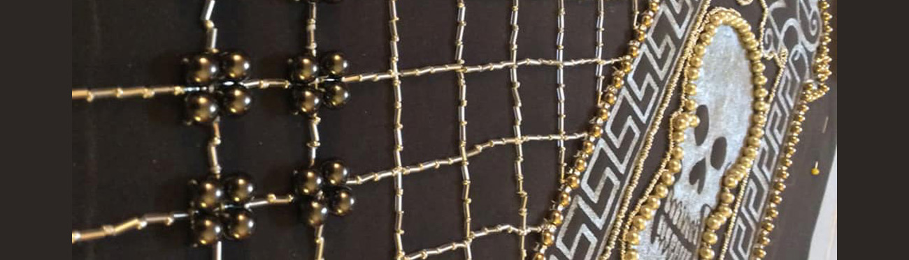
All of this boils down to fuel for how I planned to embellish the body of the outer doublet of this design, a combination of painted motifs and couched bead work. My idea was that Calpurnia is not that dissimilar to Caesar in personality to have lasted as long as his wife, and so having an aspect of militaristic feel to her ensemble might help add to her visual power since she is on stage for so short a period of time. I also wanted to allude to her deathly forebodings in her dream prophesy, so I included the skull motifs as an image to memento mori.

Page from the Jewel Book of Duchess Anna of Bavaria Commissioned 1552 
Pattern template for Doublet fronts 
Couched beading in process 
Close up of couched beading
I have a stockpile of images saved that feature calligraphy and graphic designs from the 1500s and the one featured in the above gallery has always been a favorite of mine. I like it for its simplicity of bold line use that reads as both modern and period appropriate at the same time. I had been wanting to find a way to utilize it for some time, and this project provided the perfect opportunity. It is from “The Jewel Book Of Duchess Anna Of Bavaria,” commissioned by her husband Duke Albrecht V of Bavaria in 1552. He would go on to found the Bavarian State Library. Bavaria would seem to move this well out of the Italian ethos, but I was trying to maintain context proximity to Rome/The Pope/ or The Holy Roman Emperor. Duchess Anna of Bavaria was the daughter of the Holy Roman Emperor Ferdinand I, part of the Habsburg dynasty that had its tentacles spread across Europe. The jewel book consists of 110 gouache paintings on vellum and paper depicting the official state jewels in the couple’s collection. For three centuries the text was housed in the private Ducal/Electoral “Chamber Of Artifacts” (sounds very Harry Potter-esque if you ask me), long after the originally depicted jewels had been lost to history. The manuscript was eventually presented to Bavarian State Library by King Ludwig I in 1843, where it has remained since. With a bit of modification it was a perfect fit for the design motif I wanted to use for the doublet front, both contextually for its creation connections and visually for its nod to classical Roman design motifs that were clearly in use within the period. I first painted the design on using silver fabric paint (the pattern template pinned to the back of the fabric and then placed on a light table to see it through the fabric), then the lines for the beading are traced onto the fabric, and then the hours of tedious beading and couching commence. Have you noticed a general theme of tedious hand sewn crouching in this project. Hang on to that, because I’m not done with couched cording and bead embellishment yet.
The inner core of this doublet and that of the base layer doublet (in the portrait it is a Partlet , but I wanted something with a bit more structure to support all that cord and beading, so I upgraded it) is assembled the same way….I used scraps of various canvas left over from previous projects to cut the pattern shaped from, then used felt to add structure. I pad-stitched it to the canvas via the methodology taught in the Modern Maker. If you have any questions about it, here is a lovely video of the material he presented in the traveling work sessions that formed the foundation of this video learning version:
Seeing as the process was largely the same for both, with minor adjustments based on the inner layer requiring less structure to support itself than the outer layer necessitated, here are a few photos of the “guts” of the doublets being prepared for the final assembly

Assembled base doublet 
Button hole placket 
Close up of hand-couched cording


We are in the home stretch now on this presentation, I promise. Just to verify that this is made for a living breathing human being, I will now let you see a gallery of images of me actually wearing these two layers. The outer doublet still needs three more functional button holes (plus a slew of decorative ones, but it will never be buttoned above the fourth button from the bottom) I put one in to be able to close the doublet. I am happy with the fit and the mobility of the doublets together and that I can get into them on my own (an aspect I have been trying to build into anything I make for myself the last few years, so that I need not rely on having a set of extra hands to get in and out of a frock).

The linguine sleeves in all their glory 
Back view of custom lace appliqué and painted embellishments 
Front view 
Supportassse 
Close up of carved Boone skull beads used on age of supportasse 
An early look to gauge details 
The right side of the ensemble pinned in place 
Obligatory bathroom selfie trying on the finished doublet
Here are some pics of the ensemble pinned in place so I could get a sense of how the details were working together, as well as the underpinnings in progress. I am not worrying about sticking to the sold grey color scheme for the underpinnings and thus have embraced my love of all things black and white. The Drum Farthingale is based on Jean Hunniset’s design, I added the cartridge pleated flounce at the top to help counter the “drop” that all drum farthingales will be subject to once gravity comes into play.

pair of bodies in progress 
Hand bound lacing holes 
Full pair of bodies before lacings are threaded in 
Drum Farthingale 
Cartridge pleated flounce 
2 wooden bents plus an outer rim of PVC piping
I could go on for another hour and a few miles of text about the minutiae of how this is coming together and how it fits into the larger project, but that would defeat the purpose of trying to spark a conversation between you (who are reading this) and me. If I write every last little idea and thought molecule out here, there’s little left to talk about and that’s really what I am looking forward to. But if you want to take a look at some other things I have been working on you can check out the Facebook page where I have been collecting my work at the behest of my Laurel. You can find that by looking up “A Queen’s Closet Unlocked” on Facebook, my apologies but it seems that Facebook and WordPress do not like to play nicely with each other so I cannot simply embed the link here for you to follow.
Sources

Patterns of Fashion 
Rebuilding Shakespeare’s Globe 
17th Century Men’s Dress Patterns 
Shakespeare for All Time


These are the four main print references that I relied on time and again throughout this process. I also frequently visited and emailed the online content creators cited above with questions and ideas and used the iPad Shakespeare app that gives you access to his entire body of work digitally which was invaluable for looking up text image references as I am designing.
Your work is so exquisite. I loved having this opportunity to read your research and design processes–everything is so well thought out and executed. It’s wonderful to see inside the world of theatre costume; we get so hung up on dress that we seldom look beyond for extensions of it in the arts. I love that you spent so much care looking at the meaning behind motifs.
Calpurnia may only have 10 minutes on stage, but she will be beyond magnificent.
Just wonderful. Thank you, thank you, thank you!
-Arlys o Gordon, OL, OP
Your work, as always, is stunning. I love seeing your process and the challenges you set yourself (and overcome!). Well done!
Breath taking. I loved following your thought process in how you chose the design. I am so glad you got to try some items and move from theoretical to practice. I hope you have a few more good shows left to watch as you finish the work and can’t wait to see it completed.
Aeron, this is a spectacular piece of work and I’ve been completely absorbed into your larger project since last year. Bravo! Your designs are stunning and your research and insight are top notch.
This is absolutely breathtaking–I expect to read and reread this a number of times to explore the many details you’ve highlighted here re: constructing Shakespearean theatre costumes. I feel like I’m learning a lot, when reading this, about costuming in general /as well as/ about the specific area of focus you’re calling attention to in this project. And the quality of your tailoring/costuming skill knocks me out of my seat!
Thank you so much for sharing this incredible body of work!
This is fascinating work; it’s a journey so filled with depth that I will revisit your exhibit to try understand it all. Very good work! One thing: Would you explain further what you say about, “…the knot-work being actual interwove manes of cloth…”? Thank-you for giving us a peek at your project.
Oh my! I am in awe of your research, your thought process, and your craftsmanship. I really like how you are pulling different inspirations together. I have a similar plan in mind for an Opus Anglicanum piece and seeing how you have pulled this all together will inform how I proceed. It’s really helped me in targeting my own research and inspired me to revisit what I was doing. Thank you for sharing your amazing process.
I love your amazing designs, and your exploration of Shakespearian era theatrical costumes as a theme and concept. I think this is a fascinating and fairly unexplored aspect of both textile, and theatrical arts.