The Journey
I have long dabbled with scribal arts– attempting calligraphy and illumination, painting portrait miniatures and copies of some Medieval and Renaissance images, painting charters, and creating a couple of award scrolls for An Tir and the Barony of Myrganwood. In 2019 I found myself really enjoying painting charters based on a 12th century gospel that Her Grace Duchess Inga the Unfettered had created. When the opportunity arose late in 2019 to contribute charter designs to their Majesties of Avacal Ivar and Asney, I decided to take the challenge. I have admired acanthus leaf borders for a long time, and wanted to create a visually dynamic and rich border for a charter that could be painted by others. And of course I wanted to paint it myself… I still didn’t feel confident in my ability to do calligraphy, so I asked Duchess Inga to do the lettering for the charter blank. Once the Pandemic hit and many other cherished activities were off the books, I decided to spend time upping my scribal game. This display is a record of that journey.
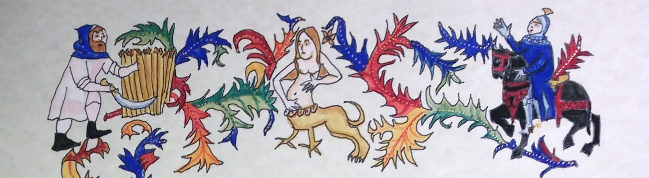
Charter Design with Acanthus leaf borders
The charter with acanthus leaf borders based on the Spitz hours was created in Fall 2019-early Spring 2020. My design challenge was to find an authentic acanthus leaf border which could appropriately frame text rather than a large central miniature. I ended up combining three leaves from the Spitz hours to create the frame I wanted, using a light table to trace elements, especially the figures embedded in the border (Fol. 98v, fol. 103v for the acanthus leaves and figures; and Fol 22v for layout).


Spitz Hours Folio 22v (black and white) for layout; Folios 98v and 22v for the acanthus leaves, colours, and figures. As this was a charter blank I omitted the background penned vines with gold leaves in my design.
The charter blank was drawn by me and inked with a rapidograph on paper. Her Grace Inga the Unfettered did the calligraphy as I didn’t feel secure enough to do the lettering. After Her Grace Inga added the lettering, the charter blanks were reproduced on a heavy parchment paper. The decorative border was then painted with gouache and illuminated with gold. I painted three copies of the charter. The COVID epidemic intervened before the last version I painted could be bestowed, so I am free to share it here.


Evaluation:
I am largely pleased both with the design and the painting. There were challenges in using heavy lines that others might follow, as it was a charter design. I referred to the original borders and included figures from the Spitz hours (Clark et al 2005) when I painted the borders. I noted places where the work would have been finer and more accurate if I were painting a one-off scroll, rather than painting from an inked charter blank, even though I designed and inked the charter design as well as doing the painting. If I were doing it as a scroll, I would have attempted to reproduce the original hand myself.
Sources
Clark, Gregory T. 2005. The Spitz Master, A Parisian Book of Hours Los Angeles: Getty Museum Studies on Art. (Figures on pp. 26, 28 and 7)
“Plague Scribal” reproducing a page from the Decameron, April 2020
I was looking for a scribal project to stretch my skills in April 2020 as other SCA activities became impossible. My intent was to find an image from the Decameron that I wanted to paint. This seemed appropriate as the Decameron was composed as a series of tales shared by nobles who took refuge in a castle together to avoid the Plague. I spent some time on google searching for an image that I enjoyed and thought I could reproduce credibly and located an image from a French version of the ms from the early 15th century housed in the Bibliothèque nationale de France. It is from the sixth tale of the third day https://www.gutenberg.org/files/23700/23700-h/23700-h.htm#THE_SIXTH_STORY3, the story of how Ricciardo Minutolo uses the jealousy of the virtuous and beautiful Catella to seduce her in the bath house. I obtained some help from my niece Cameron Allison in determining which story was being told, (she reads French and Italian, and loves the Decameron), and my partner HL Wolfram Cordeau who found an English language version of the story.
The Original Source Image

Considerations of authenticity required me to include text for the appropriate balance of graphic design for the image. As I am more of an artist than a calligrapher, I did the miniatures first. Then I did the decorative elements outside of the miniature frame.
The Miniatures


The series of images above shows my process in painting the miniatures, and then in the last frame, the layout for the text and the upper marginal embellishment (click on the images to see the full frame)
Learning the hand- practicing
I spent a couple of weeks learning the hand that the French ms. was written in so that I could add the text. Doing the calligraphy was a challenge, and I was pleased that I was able to do it.


The calligraphy is based directly on the hand in the original manuscript rather than choosing a standard hand of the right period. I deciphered the 15th C French as best I could to practice the lettering, and to be able to accurately reproduce text. I also decided to use a translation of the text as the second column in the illuminated page as most of us, including me, read English better than 15th century French. After I had practiced spacing and writing for a while, I decided that I could letter first the French and then the English.

The final steps after completing the text were to finish the illuminated capital, the left hand decorative marginal band, and the acanthus leaf motif at the bottom of the page.

Materials and technique:
The painting was done with fine sable brushes and commercial goauche paints, using a Period appropriate colour pallete. The gold is Schminke Gold Pearl paint as I don’t have sufficient skill to use gold leaf. The page was done on multimedia paper. Calligraphy is not my forte, so the lettering was somewhat nerve-wracking. I used Higgins Eterna ink and a steel nib dip pen with a fine italic point for the lettering. I also needed to do the illuminated capital, which I practiced separately until I felt I could add it to the text.
Evaluation:
I’m generally quite pleased with the painting, though I wish I had better control of painting the facial features. I wish I had had the expertise to do the gold work with gold leaf, as the letter can look dull unless the light shines directly on it. The scribal work is acceptable. There were no major errors there, and the look and spacing is consistent with the original manuscript. And I had a lot of fun doing it. I love really looking to be able to reproduce original Period artwork.
Sources
Boccaccio, Giovanni. The Decameron Day the Third Sixth Tale (translated) Project Guttenberg 2007 https://www.gutenberg.org/files/23700/23700-h/23700-h.htm#THE_SIXTH_STORY3 accessed June 1, 2021.
Folio 116r https://gallica.bnf.fr/ark:/12148/btv1b7100018t/f245.item last accessed June 1, 2021
Of corvids, working with parchment, and entering the First Inter-kingdom Scribal War
Illuminated Capital for the Inter-Kingdom Scribal War
As the Pandemic worked its way into our consciousness, there were internet memes that featured “CORVID-19” and showed 19 crow images…. at first I aspired to create images of 19 different corvids (as an ethnobiologist I know there are numerous ravens, crows and jays in the world one could render)….but soon abandoned that.
At about this time David Bianco (An Tir) created the First Inter-kingdom Scribal War. I decided to join the Avacal team, and to work on an illuminated capital that featured a corvid. To that end, I started searching for Period images of crows, ravens and magpies. This project included my efforts for the Inter-kingdom Scribal war, on parchment (samples provided by David Bianco for practice and for submission of the final letter) and a follow-up project on magpies (Pica) from the Aberdeen bestiary (see below) that involved both illumination and text executed on Arches hot press watercolour paper.
Two sources I used to locate images for my “corvid” project were http://bestiary.ca/beasts/beastgallery252.htm# “crow” and the Aberdeen Bestiary https://www.abdn.ac.uk/bestiary/ms24/f37r (see below)


My first effort was working toward a design for a letter O or C based a crow or raven. I chose the Crow in Bodleian Library, MS. Bodley 764, Folio 79v and the raven from the Aberdeen Bestiary to work on. After trying to work on a C design I liked, I decided on an O and tried designs based on both images.


Designs for an illuminated C based on the Bodley ms (left) and the Aberdeen Bestiary (right). Both on paper.
My entry in the Inter-kingdom Scribal War was an O based on the Bodley ms. As practice on parchment I also created an image based on the raven from the Aberdeen bestiary. I liked the image, but was aware that the original was not an illuminated o, but a circular decorated band around the raven. I gifted that to Sir Aiden ap Grendal, the head of our household.


The copy of the raven design from the Aberdeen Bestiary on parchment
Once I had settled on the Bodley Crow I was then challenged to find models for embellishing the capital itself. The fact that the letter was presented on a gold background meant that I had to use a colour for the letter and I chose a dark red. I needed to find images from the 12thC to give me a sense of what type of embellishment was done. I looked at the St. Albans Psalter and the Aberdeen Bestiary for guidance.

Two historiated initials from the St Albans Psalter used as models for my illuminated capital (p. 55 Collins et al. 2013)
As I researched 12th Century illuminated capitals in my library and on line, I realized that that I couldn’t justify the choices I had made for the C design above.
Below is a step by step illustration of the process of creating my illuminated capital for the First Inter-Kingdom Scribal war. First I outlined the design on parchment with a steel nib crowquill pen. Then I applied the Schminke Gold Pearl paint to the background. I painted the crow and the stylized vegetation and flowers. Then I painted the initial itself (bottom, enlarged).


Challenges for the illuminated capital on parchment:
- use of the crow quill dip pen on parchment
- difficulty in scraping the ink off when my line was imperfect owing to fats in the lambskin parchment
- a less than perfect curve on the O shape
- some issues with creating the internal design in the letter.
Miniature and text: Pica (Magpie) from the Aberdeen Bestiary
A follow-up project was doing an illumination of the magpie (also a corvid) from the Aberdeen Bestiary, plus writing the Latin text. This project was executed on paper (Arches hot press). I used the light table in making the design, but that was somewhat problematic, and I had to make lots of corrections as I inked and painted. The illumination I created edited out the man firing arrows at the perched magpies, as I like magpies (see original image above). I also changed the relative placing of the illumination and the accompanying text. The piece, intended to be a card measures (front) 15.5cm wide by 14.5 cm tall. The font copies the original of the Aberdeen Bestiary as closely as I could. Again, I spent some time practicing this hand before attempting the final lettering.

There is a scribal error (I left out several words), but the text describes the magpie as a quasi poet and describes its voice and words, and its garrulous behaviour in trees. The gold did not scan well. It was painted with Schminke Gold Pearl paint.
Evaluation and challenges, Pica:
The calligraphy was acceptable, but the red ink I tried to use ran, so I had to paint over the red letters, of the Pica heading, and ended up rendering them in paint with a brush. I also realized to my discouragement that I committed a classic scribal error and left out several words in the text as here presented. I have not finished the painting; it should have red/brown paint over other parts of the scroll work vegetation (see original image above). I like it as it is, and it has remained unfinished for some 9 months at this time. I enjoyed the graphic challenge of rendering the scroll work, and of the complex border pattern. I also enjoyed the scribal work, and attempting to decipher the Latin text.
Sources
Aberdeen Bestiary Folio 37r the magpie continued, corvo the raven https://www.abdn.ac.uk/bestiary/ms24/f37r accessed most recently May 28, 2021
Bodleian Library LUNA search: MS. Bodley 764 http://bestiary.ca/beasts/beastgallery252.htm# accessed most recently May 28, 2021
Collins, Kristen, Peter Kidd, and Nancy K. Turner. 2013. The St. Albans Psalter, Painting and Prayer in Medieval England. Los Angeles: The J.Paul Getty Museum. (images p. 55)
Final Thoughts
I have really enjoyed this journey of scribal learning. I have seen so much to admire in the wonderful work of other Society scribes. In the future I would welcome the opportunity to work more with parchment, to learn how to apply gold leaf, and to learn more about Period pigments and inks. I would love to work more on the calligraphy side of Scribal work. And would benefit greatly by lots of practice. I have learned a lot in this past 18 months. Moving forward, I plan to do more painting, and to try to find the discipline to do more practice in calligraphy. I love trying to learn a range of styles of illumination and hands. I love to look and dive into the detail of what is there. I am full of admiration for the skilled work of scribes and illuminators, past and present– creating beauty for a world that is often challenging and not always lovely.
It was great talking with you!
Thanks Margaret. I enjoyed too. Your hands are very uniform. I’m not quite so systematic….
I loved reading about your journey and the process you went through with each project. Your corvids are adorable! They have so much personality! I especially liked your self-evaluations at the end of each piece talking about both your challenges and your victories. In the Spitz Hours Charter, you didn’t even want to attempt the calligraphy so it’s great to see that your other projects included it!
I’m looking forward to talking with you about the continuation of your calligraphy journey!
Thanks, Alicia. Looking forward to talking to you too. Calligraphy has been something I’ve worked at sporadically for many years, but never felt confident about. Once I moved to using dip pens, getting even inking so it wasn’t obviously dark and light was a challenge. This was especially true for my attempts with quill pens, which is why I went to a steel nib calligraphy pen for the work in this project.
I’m thrilled to see the things you have been up to and it is so fun to see your entry from the Scribal War that you did and hear more about your thoughts on working on parchment. I look very much to getting to chat with you in person.
Thanks David. Looking forward to talking with you too. 🙂
Your work is clearly explained and an enjoyable read. You certainly kept busy.
There is so much to learn and that makes it really exciting.
I’ve done gold leaf a couple of times and it certainly takes time and practice. Meanwhile, I upped my painting gold game by recently learning to paint a wash with ochre or rose first and then applying the gold.
Keep up the great work.
Thanks, Aspasia. Yes there is so much to learn. I have underpainted with ochre first on other projects, both with faux shell gold (brass powder mixed with medium) and my one venture with gold leaf (a personal gift scroll to my son in law Sir Aiden ap Grendal on the occasion of his knighthood some years ago). I did flat gilding for the gold border frame and some decorative elements on the scroll. I have worked some with quills too, but have not felt that I was able to achieve uniformity of ink flow with quills, and I do not have much skill at cutting them. Thanks for the encouragement.
Wow, this is really well done! Thank you for sharing your journey, I enjoyed reading about your entire process, especially as someone who likes the scribal arts, but doesn’t have the artistic ability to feel confident doing it (or the desire to practice to get better!). I love your corvids, and hope that I may get a charter or scroll one day that features one (or several!).
Thank you Isabella. I enjoy rhe corvids too. I haven’t had the occasion to include them on a charter or scroll (except for a raven on Mistress Issabbella Kendal’s Laurel scrol- she is a member of Raven’s Ryft household). Perhaps this will happen at some point. I love the images from the 12th Century Bestiaries.
I’m glad you appreciated this.
From one Scribe to another THANK YOU! I loved this! I am always wanting to learn more and I find I learn the most from my fellow adventurers in Scribal arts! I will be book marking your page and coming back to it quite a bit I am certain! Thank you for taking the time to put this together and to share all your insights. I am inspired by your work and your passion!